Category Archives: Tips & Tutorials

Getting Technical

Alcohol Smash Technique Lori Craig

A few weeks ago, I was fortunate to attend the fabulous UNWIND retreat with Lydia Fiedler. The retreat was so fun because I was able to try a lot of new-to-me-techniques. I was most excited about using my Gel Press because I’ve had it for a longtime, but was super intimidated to bring it out in my craft room!

I needed some “purple” cards in a pinch this week. I don’t know what I’ve been waiting for! The Gel Press comes clean with your lift prints and the brayer is easy to rinse and wipe off.

Here’s how I did it:

  1. rolled a very thin layer of white acrylic paint onto my Gel Press with a brayer.
  2. dropped Copic Various Ink refills over the white paint and rolled again with my brayer – you have to work quickly with the alcohol inks
  3. stack a stencil over both the white acrylic and alcohol ink onto the Gel Press – here I’ve used Chevon Arrow Stencil from Taylored Expressions
  4. applied cardstock over the stack on the Gel Press and lift – the first print I used for the card on the left
  5. lift the first print and then the stencil – and press a second piece of cardstock to the Gel Press – this is the print I used for the card on the right
  6. applied both prints to cardstock bases and added sentiments

My sentiments were made with Thanks Script in Plum Punch cardstock and Thanks Script Backer in vellum – both from Taylored Expressions.

Love how quick and easy these were to make!

Palette Blending with Copic Marker

palette blending lori craig

I put together a short palette blending tutorial and video for the Splitcoaststampers newsletter this week! Such a great technique for extending color range where you may be missing some colors or for blending two complimentary colors together!

palette blending close up lori craig

My image is from the Power Poppy set called Prairie Cheer… It a gorgeous set with beautiful flowers and WHEAT! Swoon. You can see the step-by-step coloring process in my tutorial video.

palette blending full card

And, if you like great tutorials, we publish a new tutorial every Wednesday at Splitcoastampers. Use this link and sign up in the upper right hand corner box, I promise we’ll never spam or sell you! 🙂

I’m painting today…and not the fun watercolor kind… touching up trim and walls. Good times…said no one ever. But, I will be so happy when it’s done!

Thanks for stopping by! Have a colorful day!

Floating By – fun news & an intricate die tutorial

LoftyDreams Photo 1 Lori Craig

Something fun to share today… Several months ago Mary at Serendipity Stamps asked me if I would consider putting together some sentiment sets for her to coordinate with some stamp images that she had recently released. First I was honored, and second, I had never considered that before. But I thought, why not try? And, this week, I am sharing a few of my favorite sentiments with you!

LoftyDreams Photo2 Lori Craig

1398uplifting_274x274Of the sets I have created for Serendipity Stamps, Uplifting Words is my favorite! Great encouragements and well-wishes here that would work well for balloons, clouds, birds in the breeze…


LoftyDreams Photo 1 Lori CraigI’ve paired it on these projects with balloon elements from the Hot Air Balloon Reverse Die. The balloon is colored with Copic Marker (RV17, YR04, Y15, YG23, BG45, V17 and E23). The sentiment is stamped with Taylored Expressions Lollipop Dye ink. The Lollipop pink cardstock and the striped Rainbow Bright striped patterned paper are both from Taylored Expressions. The Stitched Mini Scallop Frame Dienamics are from MFT. The glitter paper was a gift to me from a friend… I have been hoarding it, and I believe it is from Stampin’ Up!

064hotairballoons_274x274 Hot Air Balloon Reverse Die is a plate that allows for a lot of creative flexibility… it cuts of both single hot air balloons or a full card-front negative. I lived in Des Moines, Iowa when I was a young girl, and I love going to the Indianola Hot Air Balloon Festival to watch scores of bubble beauties soar the Iowa plains. So pretty!


The balloon plate die does cut a LOT of little pieces (both of my cards today were created with the same die-cut – one piece of paper!) and those can be pesky to create with, so I reached into my bag of tricks for an incredible, paper-craft-life-altering tip from my friend and neighbor (love having her closeby!), Laurie Willison! Laurie has changed the way many people use intricate dies with her Press’n Seal – yes that stuff in your kitchen – Trick!

Continue reading

Play Favorites – Create Your Own Copic Marker Set

life she loved lori craig IMG_5907

We have just returned home from an extended family weekend and seeing an incredible, history-making baseball game at the KC Royals stadium on Saturday! Summer on-the-go also means I need my favorite Copic Markers in a grab and go pouch – small, easily portable and yet still representative of the rainbow!

One of the most frequent questions I’m asked as I travel and teach is “what set of markers should I buy?” Or, the close cousin question, “what colors do I buy first!?” And, that internet friends is as personal as, “do you want mayo, mustard or ketchup on your Sonic #1 cheeseburger!”

There is a lot of thought that goes into pre-selected Copic Marker sets that either Imagination International (your North American distributor of Copic Marker) or some of your favorite retailers have created, but sets aren’t the be-all-end-all for many of us!

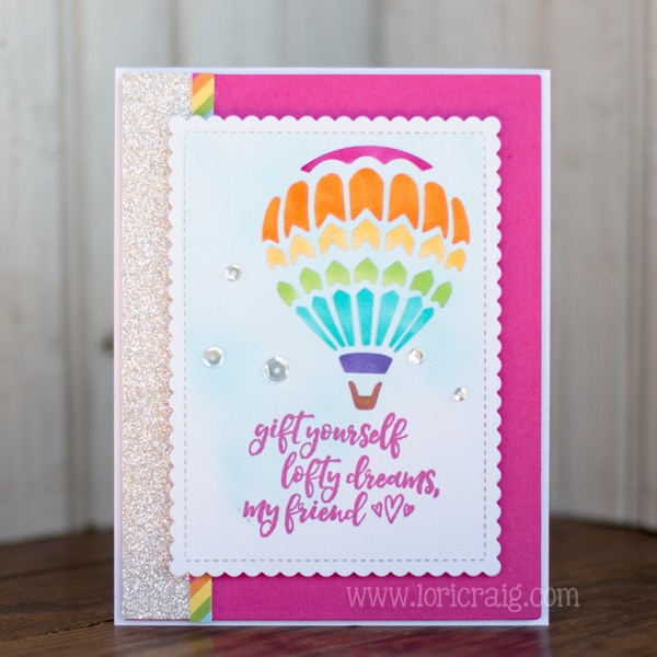
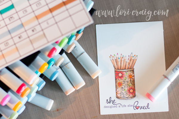
Today, I’m going to give you a peek at how I’ve selected my personal favorite ala carte colors for a travel pouch of markers that I keep ready to roll all of the time. (colored pencil image – When Your Heart Speaks – Taylored Expressions)

traveling colors lori craigIMG_5893

If I’m traveling to teach, I have specific teaching sets that I use. The colors in these sets are put together around specific images that we use to teach specific concepts in our classes, so they are heavy on shades of green and earthtones, more limited in vibrant pinks, blue greens and yellows… they are great for teaching, but not my own personal style. And, that is the problem with almost any pre-made set – you won’t love 100% of the colors represented – and with a tool like Copic, you should have the colors you LOVE first!

If I’m coloring for pleasure, I am usually doodling on a sketch pad with a Multi-liner or coloring cute and whimsy, so break it down to a simple ROYGBIV and my favorite hues. My travel set is not a collection of or representative of anything other than my favorite colors – which is how I suggest people start building their own collections:

FAVORITE COLORS that you’ll use on the type of images you love. 

traveling colors lori craig IMG_5909

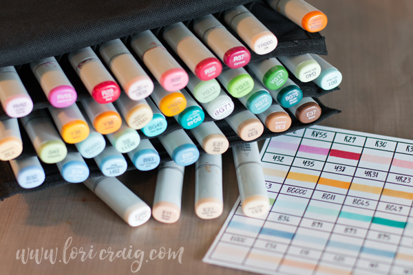
I use a 36-piece wallet because it’s small enough to tuck into my purse. (To use at home, these 36-piece empty cases work great! They are inexpensive and stand upright.) 36 colors represent about 10% of the Copic color line, so I have to be selective and there is only room for colors I really love. (And, I switch this up from time to time!)

When I say my favorites – I mean just that – my own personal favorites. I have a small selection of greens and browns for flower stems and nature, and then some more vibrant pinks, coral reds, yellows and lots of blue/greens.  You might notice that my ROYGBIV is absent of any V. I reach for violet very rarely, so there isn’t real estate in my pouch for purple. Sad to some of you, but true for me.

I started this collection by taking a look at colors I am drawn to across the rainbow. It is very helpful to see these colors in person, so a trip to a paper crafting or  fine art store that carries the Copic line may be helpful so that you can see the hues in true, natural light.

roygbi

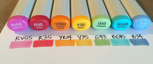
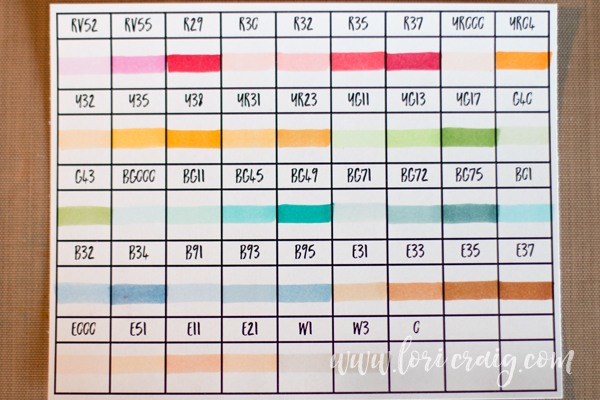
RV55 • R35 • Y35 • YG17 • G43 • BG45 • BG72 • B34

Notice that most of these colors end in a 4 or 5 – the last number indicates the value – how light or dark the shade is on paper. These are bright and vibrant colors, but unless I am coloring flat images – no shading, no contrast, no depth or dimension – I need shading options. For each of these colors I looked to the Copic Color Chart for a natural blending partner. A natural blending partner will share the same first letter (hue) and the same first number (saturation… or gray) – but the last number (value – how light or dark) will change. Look one or two colors in either direction of your favorite for natural blending partners.

In many places around my favorites I have room to include a lighter and darker shade in my kit, but in some places I only have room for one blending partner (G43, for example) and in that case I recommend that you more often lean to the lighter blending partner (G40). There are multiple ways to create darker shading with gray or another color family. In this set, I could use BG75 or maybe one of the E30s to shade G43 using a few different blending methods.  (We teach this concept in depth in our Intermediate Certification class.)

faces and gray IMG_5909

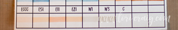
If you are counting markers in my favorite set, you’ll see this bottom row (pictured above) of colors makes for more than 36-colors in my wallet. I don’t take up room in my wallet for a simple skin color combination, two light grays or a colorless blender. I rarely color people on-the-go, so I do not need a lot of skin tone options. These seven markers are tucked into the zippered pocket on the back pouch of my Copic wallet so that I have them when I need them, but they do not take up precious slots.

bg71 lori craig IMG_5900

You may have noticed this tacky label for a BG71 color in my favorites – and it may or may not have occurred to you that Copic does not make a BG71 color.

BG70s

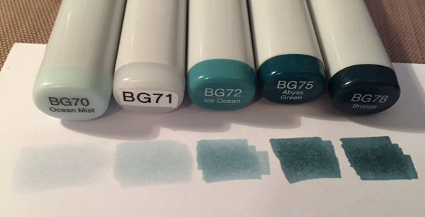
The BG72/BG75 color combination has always been a favorite of mine, and long before BG70 was introduced a few years ago, I needed a lighter shade that would allow me to blend from BG72 toward highlight.

bg71

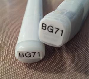
Using Various Refill for BG72 and BG000 – I created my own custom color that I called BG71 in an empty Various Refill container and adding to an Empty Sketch Marker. I have several colors that I’ve created for my own personal preference, and I suggest mixing those colors in the refill bottle and then filling the empty marker – this keeps your color formula consistent in the barrel of the marker as you refill. This is how I’ve ended up with BG71 in my favorite 36!

traveling colors lori craig IMG_5909

After you’ve created your own personal kits – keep a filled in color chart and the Copic color chart handy so that you can be intentional about where you add colors when the opportunity arises. Empty Copic color charts and the complete Copic color chart and wheel are available as free download resources!

life she loved lori craig IMG_5907

I hope this gives you some confidence to look at building your own set or collection:

  • Look for colors you love and build with balance.
  • Add blending partners (same hue and first number) to your favorites – leaning toward a lighter partner if you can’t add both light and dark.
  • Keep a blank color chart and a color wheel handy to look at how you would change your look and add new colors intentionally.

I have a busy week ahead, and I’m wrapping up our Copic certification classes for the year in Des Moines this weekend! After this weekend, I’ll move to teaching workshops for the rest of 2016. Come and see me!

Felt and Ribbon Rainbow Bookmark

Hot-Ribbon-Final-Close-LoriCraig

Happy New Year’s Eve today! I hope you had a beautiful Christmas and holiday season with friends and family! I know that we sure did.

My oldest daughter had asked for a study Bible for Christmas, and earlier this week when we were studying together she mentioned needing a bookmark. So, this morning I pulled out some felt and Hot Ribbon to make one for her that would be flat in her book and hopefully hold up a little better than paper. Teenagers aren’t known for gentle ways. LOL

Continue reading

Pocket Full of Posies: Copic Tutorial

loricraig_pocketfullofposies.jpg

HIP HOP! I had a chance to get crafty with my Unity Stamps earlier this week!

Angela posted a sweet story on her blog today about our ‘meeting’ almost 3 years ago. It’s funny that my mind never goes back to that particular story. My mind goes back to meeting Angela and Chris at a Cupcake Reception the Splitcoast Team had hosted at the Winter 2008 CHA show. Unity was launching at that show, and I remember being WOW’d by how warm they were, the vision for Unity – in the earliest days and of course, their love of laughter. Good, good times.

pocket-of-posies_close.jpg

When Maren asked me to create a project for this week, she said, ‘just do something you do’. LOL! Well, as of lately, that would be all about Copic. This card features texture with Copic Blender solution, and after several failed video attempts, a second video camera and 17 colored pockets later, I created a tutorial for the fabulous HIP HOP crew. It’s featured on  the Unity blog today. How cool is that?

Here’s a picture of Angela and I at CHA a few weeks ago:

angela-magnuson.jpg

I love this girl!!

and, here’s my video:

[youtube]https://www.youtube.com/watch?v=eK1Yxj2jqiA&hd=1[/youtube]

Hope you find a chance to put some HIP HOP in your day. It’ll make you smile. I promise. Just say it to yourself right now, ‘HIP HOP!’ See, you are smiling! I know it! Thanks to the Unity team for making me smile a LOT these last few years!

See you tomorrow!

Lofty Heights

lcraig-082909b.jpg

I got the warm fuzzies when Michele told me todays Ways to Use It Challenge at SCS would be FUZZY STUFF. (Check out her darling dolly sample.) I knew immediately that I would use this sparkly white flock for clouds. I stamped the clouds with Black Memento on white cardstock and cut them out. Then I used Aleen’s Tacky Glue to cover the inside of the clouds and gently pressed into the flock that I had poured out of the container, glue side down. I love how the white pops against the creamy tone of the text patterned paper (Cherry Hill – October Afternoon). The vintage balloon image is from Verve’s Up, Up & Away. I stamped the balloon on patterned paper for the red and cream design. It’s accented with a tiny black twinkle and raised up with dimensional dots. I added a little bit of depth to the balloon with Copic Markers W0 and W1 – my favorites for shading. The basket is colored with Copic E35.

lcraig-082909.jpg

I stamped my sentiment in black pigment ink and embossed with detail clear embossing powder. I like to emboss when I’m stamping over patterned paper. Helps the image pop. Used another one of my stacked Prima flowers (I’m so glad I put so many of these together last weekend while watching tv. It’s too easy to grab and go.) Notice my linen thread is kind of FUZZY? 🙂

Continue reading

Honey Do Lists

img_9505180809.jpg

Julia has been doing some beautiful stamp design work with the Rummage Bin line at CHF. I adore this Sweet Bee set, and I thought I’d make up a few Honey Do Lists for the girls’ teachers. I was really looking for a way to use some of my layered and buttoned flowers and a few bits of the new October Afternoon: Farm Fresh. 😉

img_9504180809.jpg

On Saturday afternoon, I took a jar of big creamy Prima flowers and layered them and sewed on buttons while I wanted a movie with the girls. My oldest always wants to know why I don’t ‘just watch tv’. Well, the truth is it’s hard for me to just sit still and not do ‘something‘.  So, I watched a cute movie, completed about 15 or so big ole button blossoms and had some wonderful quality time with my family.

I even finished the inside with October Afternoon’s Farm Fresh – South Forty and Farm House patterns (available late August) paired up with Core’dinations Cardstock from the Vintage Collection – Autumn color:

img_9506180809b.jpg

inside quote: that is shall never come again makes life so sweet ~ emily dickinson

This skinny notebooks came from my stash. Like many of you, I buy the little legal pads at an office supply store and have them cut them down the middle for me. The store will cut the whole stack at one time with a nice crisp cut. The covers dimensions are easy: 8″ tall by 5 5/8″ wide – score at 2 5/8″ and then flip and score at 2 5/8″ from the other side. That leaves you with a 3/8″ ditch for the width of the legal pad. I attach the notebooks to the covers with a sticky tape. They aren’t going anywhere.

Mmm, paper buttoned blossoms and a lesson in fractions – all in one day.  I know Mish makes these notebooks a lot and has included lots of tips and tricks over time to make the covers, so I won’t re-invent the wheel.

img_9503180809.jpg

I did have a little ah-ha! moment while I was working on these last night. I originally stamped the Honey Do List four or five times on white cardstock with brown Memento ink and colored with Copics (YR21, YR23, YR24 and W1) and then realized that I should have used cream cardstock. Since I got an air compressor for my Copics, I’ve been much more liberal with the air brushing, and I thought I’d try to change the tint of the cardstock because ivory would look much nicer with my flower and my printed paper. Easy peasy:

Continue reading

Cupcake Sketch 49 & a mini tutorial

010109img_7945.jpg

I really enjoy working with sketches. My idea with Taylor’s Sketch this week was that I would use the cardstock square to frame the circled images placed underneath – not layer the circled images onto the cardstock square. Does that make sense? Of course, the end result was some squiggled stitching around the whole main panel, so it didn’t really matter which one ended up on top: the frame or the circles.

You might want to try the ‘frame’ method and give it some depth with dimensional dots sometime, so I have a fairly easy way to line up all of your circle holes to create the frame. After I shot all the prep photos – I had to roll with the final project – squiggled stitching and all.

Continue reading

Peace on Earth

cut-shape-sample-lcraig-102808.jpg

A second sample for the Tutorial Blitz that is going on at Splitcoaststampers. You can see this tutorial here! The top blue layer is stamped with snowflakes from Verve Stamps, Winter Wonder set, and then I smooshed VersaMark Frost (Tsukineko) all over the cardstock to make it shimmer. It has the same shimmer effect as Cryogen White (or SU’s Shimmery White) cardstock. Very pretty. The white tag was cut with Curved Rectangle Nestabilities. You can find the Nestabilities or the VersaMark specialty pads from Ellen Hutson.

Be sure to check out the Home Page at SCS everyday this week for a fun new project or pretty to get a jump start on your holidays. Have a wonderful week!