Category Archives: Reverse Confetti

To the Moon and Back

IMG_6235

It’s been a long time since I’ve been so excited about colorful new stamping mediums, but this is the actual day! Our Splitcoaststampers Product Focus team was asked to work with a new ink line from Clearsnap called Dyestress Blendable Dye Inks.

I was a little bit nervous about working with the Dyestress Inks. Personally, I’ve never had good luck with other blendable inks — I drool over other stamper’s backgrounds and blending that I see on the internet, but no matter how hard I tried, I would always have foam or brush marks on my finished projects… I could never achieve the beautifully smooth blends.

Lori Craig MoonandBack Oct2018

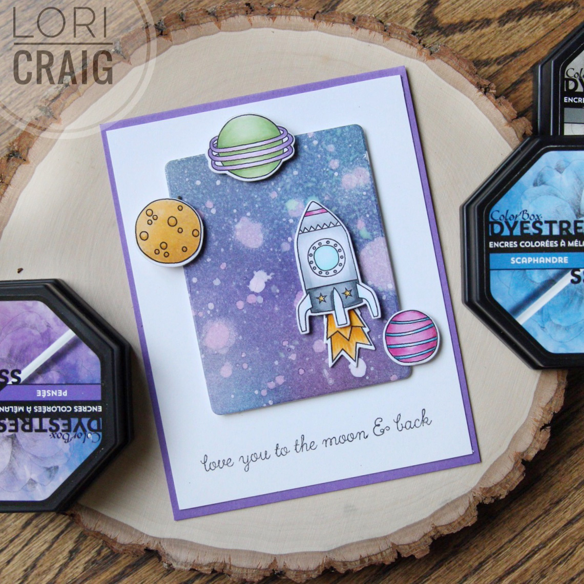
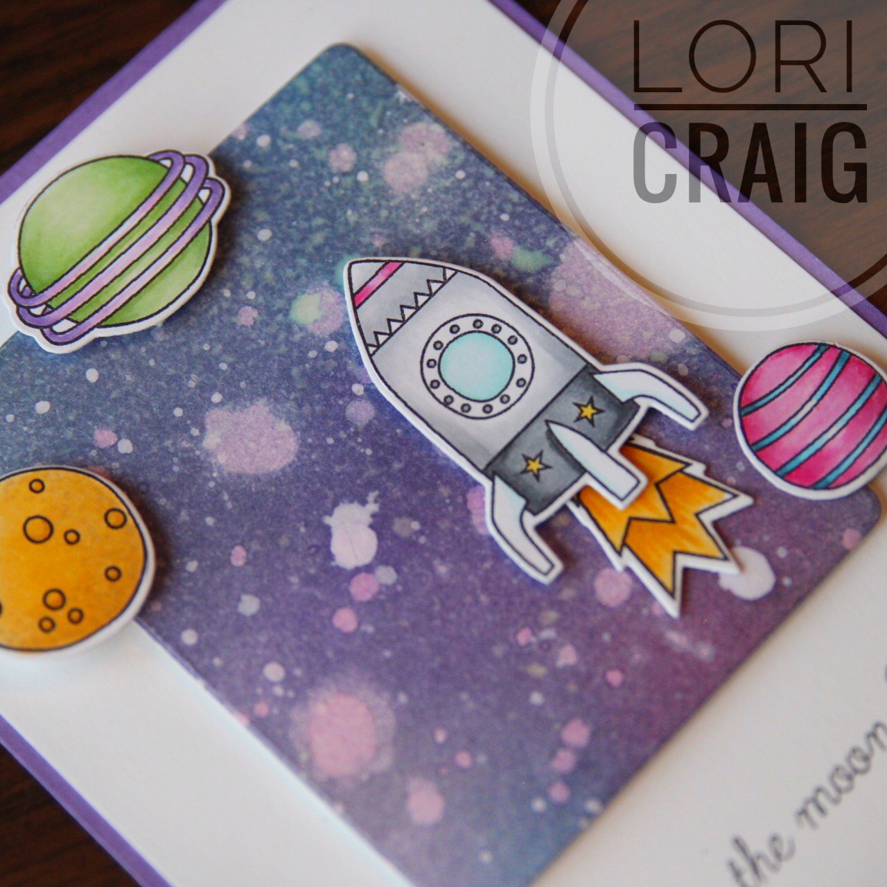
I could not believe how rich and smooth the colors blended for me on Bristol Smooth Cardstock to create this galaxy background. These inks stay wet long enough to dab with a papertowel or rag for texture, and they lift beautifully with drops of water that is spritzed and dripped and then picked up from the cardstock with a paper towel. When the cardstock was dry, I flicked drops of Ph Martin’s Hydrus Titanium White all over the blended inks. When that was dry, I shot the whole thing with a spritz of Imagine Crafts Sheer Shimmer Spritz that I borrowed from Kelly Lunceford at a retreat last weekend.

My images are from Reverse Confetti’s set Moon Men and color with Copic Markers. I do love how this turned out… I may even send this card! LOL

Lori Craig RidiculouslyHappy Oct2018

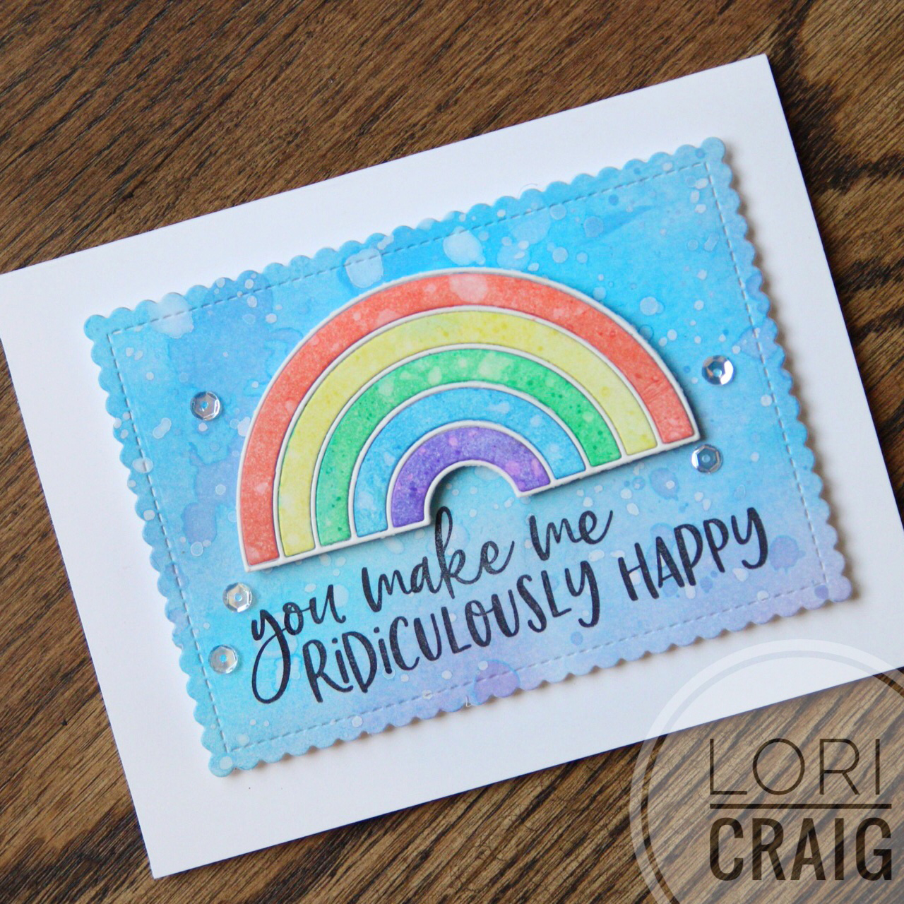
The second card I made for this project was a simpler blend of color and the same water lift of drops and spritz of water to absorb the color on Bristol Smooth Cardstock.(Yes, the paper makes a difference!) The colors of blendable ink I used for the background were Moonstone, and Heather, the rainbow was created with Salmon, Citronella, Shamrock, Scuba and Pansy.

IMG_6234

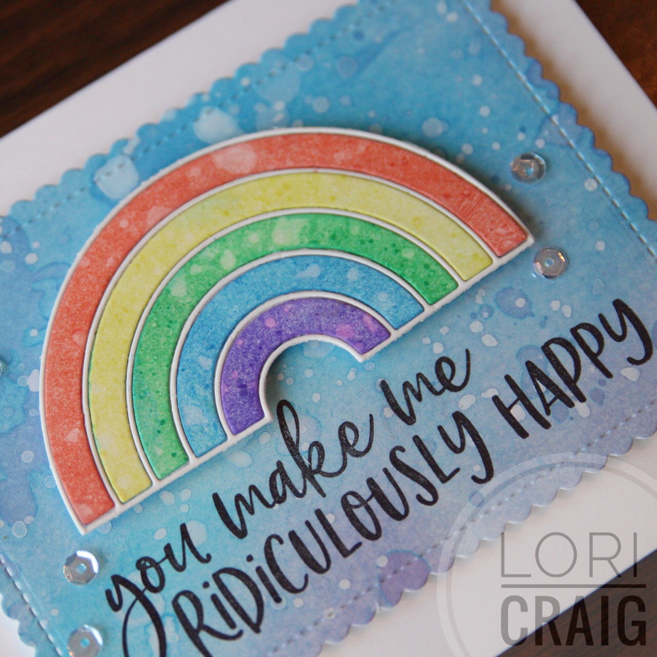
I used the Rainbow Die from Waffle Flower (so sweet and perfect!) and a sweet sentiment, Ridiculously Happy from Honey Bee Stamps.  Sequins from Studio Katia – super bling! Love.

IMG_6230

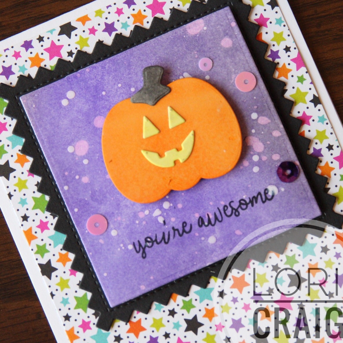
One more little Dyestress Ink project to share today… The colors I used were Heather and Pansy, again on Bristol Smooth Cardstock. The same water lifting technique and when the cardstock was dry, I flicked drops of Ph Martin’s Hydrus Titanium White all over the the purple background. Adorable Pick a Pumpkin die is from Newton’s Nook. Sequins from Studio Katia.

I love these inks, and so did the Product Focus review team. Take a look at their reviews here, and an inspiring project gallery here.

I stamped a lot over the weekend, and I’ll have projects to share over the next few days! Thanks for stopping by!

Every Sunrise…

FullSizeRender (3)Falliday Fest Lori Craig

A quick watercolor share today. I’ve been watercoloring a lot lately… on paper, in a sketchbook… of course that means collecting watercolors, too. I’m loving it because I can grab my little watercolor/sketch roll and go – that seems to be standard mode of operation these days.

On this card, I am using Reverse Confetti Rose Garden and Rose Garden Confetti Cuts. I loved this sentiment from Forever in our Hearts. All of my sentiments, images and embossing texture were embossed with Princess Gold Embossing Powder. I love the tone of the gold on this one. So soft and pretty, sparkly, but not brassy. I like to wet the inside of my embossed image with a clear water brush and drop color into the flower petals. Such a fun, easy and forgiving technique.

I’m updating the Copic class page on my sidebar today! Lots of fun locations coming up soon – including Anaheim for me to teach our new workshop classes: hand lettering, coloring animals and landscapes. Come and see us! Can’t wait!

Thanks for stopping by!

Beautiful Day

Beautiful-Day-Full-Lori-Craig-600x600

Some time in the craft room over the weekend… it had been so nice and warm here all last week, and then the weekend brought a cold wind. I’ve been itching to work on a project out in our barn, but I’m a fair-weather girl out there… I’m also in-between teaching trips right now, so hanging out in the office was a perfect time passer!

I’ve chosen a clean and simple look for this card so that the bold blossom shines, so today I’m sharing some things that help your clean and simple designs rock! Believe it or not, this design style can be more difficult to pull together than a card with lots of details. When card design has clean lines, it is hard to hide imperfect details, but there are things you can do to help yourself!

beautiful-day-close-up-600x600

This is a card that I watercolored with Rose Garden from Reverse Confetti. I love Jen’s bold, graphic designs – and watercolor softened this one up so easy peasy.

The images were stamped with Ranger Embossing Ink and sprinkled with Princess Gold Embossing Powder – love, love this shade of gold – not to brassy and just the right shine. I don’t have the Rose Garden Cuts to this set, but the not-at-all-fussy cutting was super easy.

Today, I’ve used Tim Holtz Watercolor Paper…. Heavier watercolor paper can be a bit more challenging to create layered cards with because it warps a little with the water – you can always re-mist after you have painted and flatten with pressure (a heavy book sandwich anyone?), but I don’t suggest ironing paper with embossing powder to flatten. The heat will melt away your embossed detail.

hightack foam

high tack double sided


What makes this type of project with heavier paper easy to assemble is a good adhesive. Here, I’ve used a combo of XPress-It high tack adhesives –  High-Tack Double Sided Adhesive and High-Tack Double Sided Foam Adhesive. The firm hold is great for both flat or lifted layers and the low price-point is perfect. One thing I appreciate most about the double-sided tape is that the layers of my large white panel stay completely adhered to the white card base, no lifted or curled corners.

beautiful-day-lori-craig-tsquare-600x600

Finally, straight layers or wonky – there is no middle ground here, straight means super straight. First, I’ve laid a simple layer of thick Gold Glitter Deco Tape from Imagination International at 1/3 from the bottom of the card.  Then, I wanted to share a little tip for squaring up the free-floating layers with you. I use a simple, clear plastic t-square. I got mine at Hobby Lobby, but found this one at Amazon to show you an example. Makes it so quick and easy to line things up evenly which is very important with a CAS design. At the last minute, I added a bit of soft, super light-weight gold thread behind my rose bloom.

Beautiful-Day-Full-Lori-Craig-600x600

That’s it. Done, and I’ll be dropping this in the mail. I’ve been sending more cards lately. I hope it brings a smile to the recipients, and it sure does feel good to share the love.

Wishing you a beautiful day, friends!


Comfort & Joy

FullSizeRender (21)Falliday Fest Lori Craig

Another Falliday Fest card to share with you… this idea came from Holly Brown and the challenge was to add holly and berries to your card. I am loving the Christmas projects that this set of challenges encouraged me to think about and execute! I didn’t get any mass production done for Christmas, but I have a LOT of fun ideas that I can pull together quickly now! Love that!

I loosely watercolored the blue and green background and cut with a tag die. Next, I cut the holly and berries from watercolor paper and painted loosely. This is a fun way to watercolor and not have to mess with sticky details!

The  holly die and the cute tag die are from Reverse Confetti, and this was so easy to make that I’m thinking of going into mass production for a handmade Craig Christmas card for the first time in too many years! The holly leaves are scored for easy creasing and dimension and the berries have two layers so you can easily add the highlight and a little depth! Details! Details!

FullSizeRender (20)Falliday Fest Lori Craig

The sentiment is from an Avery Elle set called Comfort and Joy! It embossed beautifully with a new embossing powder – Princess Gold from Ranger.  (You can also find it at Michaels!) When you emboss over watercolor, make sure that the watercolor is 120% dry (totally dry!) or you will have an embossing powder mess on your hands! (Ask me how I know!) I’d be extra careful and use an embossing static removal tool – I have lost mine, so while I was at this retreat, I (accidentally permanently, it seems because it came home with me) borrowed one from Jill Hawkins. (Sorry, Jill! I will think of you fondly every time I use it until we meet again!) 

Thanks for stopping by today… I’m fortunate to be pulling together some month end projects and crafting away. Happy Friday!

Holiday Wishes

Falliday-VASunshine-LoriCraig

I am just home from an amazing crafty weekend where I had the opportunity to create a LOT of cards for the Falliday Fest at Splitcoast! I’ll be sharing over the next few days, but I couldn’t wait to share this one for Teresa Kline’s AWESOME challenge for today.

falliday fest graphic

I hope you find time to join us for Falliday Fest – we have some amazing sponsors and great gifts up for grabs! Still plenty of time to create and win this month!

This was created with Merry & Bright bulbs from Reverse Confetti. I *LOVE* their style of these word/image stamps. (I see several in my near future!) I paired it with this awesome sentiment from Avery Elle called Comfort & Joy. The sentiment and the bulb metal are embossed with Princess Gold Embossing Powder from Ranger. The ink colors are Mint, Crumb Cake and Blushing Bride from Stampin’ Up. Paper is Curious Iridescent Shimmery White and Kraft. Scalloped Layer die is from Mama Elephant.

I hope you find time to

Happy Sunday!