Category Archives: Ranger Products

What Sunflowers Do

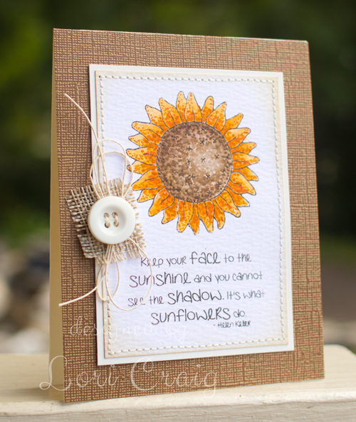
Keep your face to the sunshine and you cannot see the shadow.
It’s what sunflowers do. ~ Helen Keller

At Splitcoaststampers, we published a Product Focus review for our friends at Ranger this morning. A Product Focus is an in-depth look at a specific product or product line with how-to, photos, videos, links to appropriate tutorials, reviews from fellow paper-crafters and projects to inspire you.

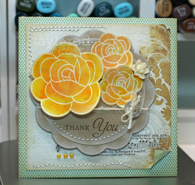
We were specifically looking at Distress Markers this week. How pretty and what fun!

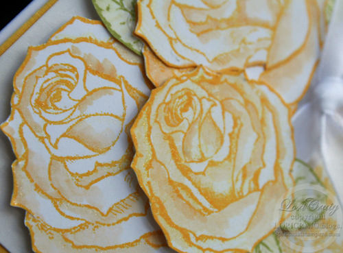
I stamped this sunflower image and sentiment from Prim Blessings (Sweet ‘n Sassy Stamps) on Distress Watercolor Cardstock using Timber Brown StazOn ink. Then I set to coloring with a combination of Wild Honey, Spiced Marmelade, Ripe Persimmon, Gathered Twigs and Barn Door Distress Watercolor Markers. The colors blended very easily on the cardstock with the Detailer Watercolor Brush, and when the first layers were completely dry, I went back over the leaves and sunflower center with my markers to add texture, using both ends of the marker (brush and detail tip) to add dots for added depth.

I only have one brown Distress Marker and the Timber Brown has more of a yellow undertone to it than I preferred for this image. The beauty of watercolor markers is that you can create a palette of two inks and mix a new color right beside your work space. That’s what I’ve done here. Easy.

You can read our full team review here. The ladies really loved working with these markers, and I think they rocked the gallery with beautiful projects.

Have a GREAT Wednesday!

  • Stamps: Prim Blessings – Sweet ‘n Sassy Stamps
  • Ink: Timber Brown StazOn – Tsukineko
  • Cardstock: Distress Watercolor Cardstock – Ranger, Distress Color Kraft Core Cardstock – Core’dinations and Whip Cream Cardstock – My Favorite Things
  • Other: Wild Honey, Spiced Marmelade, Ripe Persimmon, Gathered Twigs and Barn Door Distress Watercolor Markers – Ranger, button, twine, burlap ribbon

Choose Faith

I put this together for one of the Dare to Get Dirty challenges for our amazing Splitcoaststampers Fan Club members last week hosted by the one and only Lydia.  I think this met her criteria with several of the key components.

I used a new stamp set from Sweet ‘n Sassy Stamps for this project. The silhouette stems and pretty sentiments of this set, Celebrate Today, really spoke to me. I’ve used it several times in the last week alone.

My crinkled ribbon is actually seam binding. If you tie your ribbon and then mist it with a water mister, you can scrunch the ribbon very quickly and it will dry pretty fast, as well, while holding the crinkle shapes.

The poppies were colored with Distress Markers – direct to stamp. First, I colored them with Worn Lipstick and then tapped Fired Brick over the poppy blossoms. Easy. Peasy. I love that look. The stems were colored with Shabby Shutters.

The dies are from a Spellbinders collection: Marvelous Squares. They cut beautifully. The Splitcoast Product Focus team published a review on this line from Spellbinders last week, too. If you missed it,  you can find some common sense feedback and great projects using the Spellbinders Enhancing Elements here.

I accented the corners of the top layer with Liquid Pearls. A very easy way to dress it up.

I have a few more projects to share over the next few days. I think I ended up with about 18 or 19 cards for the week of challenges. I wish I would have gotten to all 42 challenges, but I don’t think 18 is too shabby considering a full work-load, two pre-teen girls who are so bored, bored, bored with the long summer days, a long weekend trip out of town with old friends and a Taylor Swift concert with above mentioned girls.

I’ll be back in a day or two. Thanks for looking!

She Adjusted Her Sails

My busy travel schedule for the spring is over, and I’ve been stamping lately. Amazing, I know.

I sent this card to a good friend. The last few months she’s been trudging through unchartered waters as her oldest son has joined the Navy.

My friend is just as proud as can be of his decision (as are all of us who know and love him!) but, her momma-heart does ache for the changes that it’s brought to her family. I get teary for her myself, and I’m reminded of the sacrifices that many families and extended families make to serve our country.

She stood in the storm, and when the wind did not blow her away, she adjusted her sails. ~ Edwards

How I made my card: This week, I’ve been working on a Product Focus product review for Splitcoaststampers using Embossalicious Folders from our friends at Crafter’s Companion. This was a card that I made two weeks ago for the review. I really do love the embossing folders because they come in a 6″ x 6″ (and 8″ x 8″) format so I can emboss a full card front in one pass, and in either direction I want! Yes!

I used Petite Dots embossing folder on my background layer of Broken China Core’dinations Cardstock and then dabbed the dots with Picket Fence Distress Paint.

The blue watercolory background layer for the sentiment on this card was made with Chipped Sapphire, Broken China & Salty Ocean Distress Paints from Ranger. I dabbled each of the colors on a craft mat and misted with water. Then I drug a piece of watercolor paper through the muddled colors. It dried with such a vibrant, matte finish. Love working with those paints.

The stamped sentiment is from a new Verve Plain Jane (meaning it’s a one-stamp  set at a really, really nice price!) called Adjusted Sails. The floral pieces on the left were cut with the Floral Frenzy dies, also from Verve.

Be sure to check out our review, and if you like the look of the dry embossing,Crafter’s Companion is offering a 40% off coupon thru June 24th, 2013. Look at the right hand column of the linked review page for the details on that 40% discount.

Thanks for stopping by! My spring travels are over, and I won’t be such a stranger to my blog, I promise.

Thank You.

Can I even tell you how happy I am to be sketching again with the Taylored Expressions Sketch Crew? We took a much needed hiatus over Christmas, and I am glad to be getting back into the swing around here. This is my sample for TE Sketch 151, and you can see the sketch here. Hope you play along. We’ve got a prize!

I had ordered this Rosy Posey set when it was released. I loved that the roses had matching dies. Made it so easy. I knew immediately I was going to try a reinker technique that I had seen a while ago, Watercolor Bleed. You can see a step-by-step tutorial here.

To color my roses, I embossed the rose images onto shimmery white cardstock (I use Curious Iridescent.) with VersaMark and clear embossing powder. Then I used an aquabrush with water and brushed over one petal in one of the rose images and then dab a bit of reinker onto the wet flower petals to add color. Because the cardstock is wet, the reinker shifts and spreads, giving you a lovely pattern. Before the extra water can soak into the cardstock, I dab with a paper towel to remove the excess moisture. I just keep repeating that process until I have the depth of color that I want. The reinkers I used here are Ranger Adirondack Summer Sunshine and Peach Bellini.

The card was put together with paper from the My Mind’s Eye – Lost and Found Sunshine. What a yummy collection of paper!

I hope you get a minute to visit the Sketch Crew…they have some super sweet samples to share this week. (I got a peek last night, so I know!) They are:

I’m under the gun to get my gear packed and head out for CHA. Very excited to be seeing my friends and co-working family! And, while getting out the door is a little stressful…I’m not to disappointed to be looking at this:


A Rose is a Rose…

yellow-rose-2.jpg

This is a card that I worked on last week for VSN, and I never ended up photographing it. The roses from Flourishes are stamped in Sunshine Yellow Adirondack ink, and colored with Copic Marker YR31. I used a Spica glitter pen to accent the petals.

yellow-rose-lcraig.jpg

I used the Tulle Damask Scrapblock from Cornish Heritage Farms to finish off the bottom of the panel. A little ribbon and a few white Kaiser pearls finish this off. I’ll add a sentiment when I decide where I’m sending this. Thanks for looking. I’ll see you tomorrow.

And, what about the winner of the sketch challenge?

Here are your random numbers:

42

That would be Stephanie Kraft with a so pretty card with Verve stamps. Congrats, Stephanie! Thanks to all for playing along. I loved looking at all of your cards. I know I’ll be using that sketch again.

Christmas Priori*tea

 close-up-label-lcraig-112308.jpg

 Today in the town of David a Savior has been born to you; he is Christ the Lord ~ Luke 2:11

Several years ago, a friend gave me a baby food jar with a spiced tea mix and a sentiment about making Jesus my Priority. The idea was that we would make time for Him in our busy daily lives. I kept the empty jar, label facing out on my spice shelf long after the tea was gone. I was thinking about all of the special gifts that I need around Christmas, and thought this tea would be perfect for a few. Isn’t this the time of year that we get most lost in the shuffle and bustle and forget a few of our priorities?

group-lcraig-112308.jpg

I used the recipe that Sharon shared last year HERE, but if you google ‘spiced orange tea recipe’ – you’re sure to find a recipe that suits your fancy. There are many. I put my tea mix in cello bags and then inside new kraft coffee bags. The coffee bags were stamped with the Fiery Floral Scrapblock from Cornish Heritage Farms. I used a Cranberry Pigment Ink Pad from Ranger. It gave such a rich, deep look.

sentiment-placement.jpg

Next, I stamped the sentiment with my JustRite Stampers, C41 Stamper and mini alphabet. Pssst, they are having a ‘buy one, get one free’ sale thru 11/30/08. Check it out HERE. The ‘Believe’ is a Rummage Bin sentiment that I love, created by the beautiful Lesley Langdon for Cornish Heritage Farms. It took a few minutes, so stamp several when you get it all set up! 😉 Don’t forget your Stamp-a-ma-jig.

I used Cranberry and Pesto Adirondack Dye Ink on the labels. It’s great that Ranger offers the colors in both dye and pigment ink. Make coordination a breeze with the proper ink for different mediums. Speaking of coordinating, the brads were colored with Copic Marker R59, it matches perfectly.

full-size-lcraig-112308.jpg

I cut the labels and the matted frames with Nestabilities. The tags are MayaRoad chipboard covered with Basic Grey Wassail patterned paper. I used Mod Podge to adhere the paper and dimensional dots to pop up the die-cut labels. Various ribbons from Webster’s Pages, Beaux Regards and May Arts (all available from the fabulous Cindy Lyles at StarLitStudio) finish it off.
112308img_7293.jpg

This is the label on the back with a few suggested Christmas readings for a few stolen moments of quiet time. By the time I got here, I was getting lazy, so these are just printed on a clear label from the ole computer. 🙂

I’ve had a wonderful weekend full of crafting and getting ready for Christmas. More tea packaging, gift and Christmas ideas to follow this week. What’s up tomorrow? A challenge issued by Jami. She’s the bossy one! <wink> So, I wouldn’t dream of not following orders. See you in the morning.

For the Man

out-for-pub.jpg

In honor of my 12th wedding anniversary yesterday, here’s a card for my dear, sweet husband. While he’s not a ‘cowboy’ in true definition, he say’s “y’all” a lot, works in the agriculture field, drives a pick-up and lucky, lucky for me….I get to wash my fair share of Wranglers. Our first date was the 1992 Dodge City Round Up, so he’ll always be my cowboy.

This falls into play with the CHF Challenge Chicks today to create a masculine card. I used ‘For the Men’ from the Rummage Bin line and beautiful new paper and accents from Prima (I got mine from sweet Jacksonbelle). While masculine cards can be hard to wrap your mind around, my stand-by is clean lines and simple stamping. I’ve used a paper punch and distress inks to give it a western feel.

There is *SO* much going on this week with CHA departure in just 2 days! Make sure you stop by Mona Lisa’s blog for incredible new licensing agreement information…can you believe Saturday Evening Post?? Check out the other chicks for more masculine inspiration (and other exciting CHA pre-sneaks for product and new art!): –Kristine Reynolds, Dawn Lusk, Julia Stainton, Michele Boyer, Val Stangle, Kim Hughes, Lisa Silver and Sherrie Siemens

O Holy Night

3kings-lcraig-070208_edited-2.jpg

I’ve been working with the new Aimee Nugent Christmas line for several weeks. Today is release day and all of the Aimee images and coordinating Christmas sentiments that I have been using are available for purchase.

This main image panel started out as Cryogen White (shimmery). I used the Emerging Color technique found here at Splitcoast, so the words O Holy Night were actually the first image applied to the cardstock. I love this technique – it’s fun, not too messy and generally good for a few oohs and ahhhs.. 😉 I love the colors of this Christmas paper from Webster’s Pages.

Editted: Most of the CHF team has peaks of another fabulous new product that will be unveiled at CHA on their blogs, so almost any link from the team sidebar will get you a free shot at some hot stuff. The eye candy I’m posting is from sweet, sweet Kim Hughes. Look at this gorgeous CocoMocha paper that is being shown at CHA! Good stuff!

cocomocha_solid-copy-2.jpg

  • Stamps: O Holy Night – Christmas Expressions & Three Wise Men – Aimee Nugent – both from Cornish Heritage Farms
  • Cardstock: Cryogen White, Spring Willow Medium, Blush Red Medium and Webster’s Pages patterned paper
  • Ink: Cranberry Adirondack – Ranger, VersaMark – Tsukineko
  • Accs: Ribbon, Brads & Scalloped Rectangle Nestabilities

Ranger Paint Dabbers

paint-dabber-tutorial-lcraig.jpg

I was putting some supplies away this morning, and I realized that I never shared this card and tutorial with you on my blog. This is a card I created for a tutorial at CHF a few months ago. I love the Ranger Paint Dabbers because you get a really thick color lay with them. This pearl is my favorite. You can see the entire tutorial for Paint Dabber Resist HERE.

Have a wonderful Sunday!

  • Stamps: Large Polka Dot Backgrounder, Silhouette Blooms II – Kim Hughes Collection – all Cornish Heritage Farms
  • Cardstock: Prism Cardstock in Frosted Teal & Black, Cryogen White
  • Ink: Watermelon and Black Adirondack Dye Ink by Ranger
  • Accessories: Pearl Adirondack Metallic Paint Dabber by Ranger, Nestabilities Scallop Circle and Classic Circle Dies by Spellbinders, Offray Ribbon and Paper Piercer


Spinning

spinning-lcraig-061008.jpg

 Finally, a set for the folks (like me) who feel like they are spinning circles all the time! This set is called Round & Round We Go. This is my life….

  • Stamps: Round & Round We Go – Rummage Bin from Cornish Heritage Farms

  • Cardstock: Super Smooth White Prism, Striped notecards – Target

  • Ink: Black StazON, Red Pepper, Citris, Peach Bellini, Pink Cloud Adirondack

  • Accs: Dimensional Dots