Category Archives: Splitcoast Stuff

Peace


spellbinders holiday peace blog


Sharing a card this morning that I created for Joyce’s awesome Hope You Can Cling To challenge. The Spellbinders Peace Sentiment die and Regal M-Bossabilities folder made quick work of this one.

Still plenty of time for you to join us for Hope You Can Cling To challenges at Splitcoast. Great campaign for cancer awareness, sharing hope (either with cancer patients at MD Anderson or your own friends or family who are facing cancer now!) and many, many (over $5,000) prizes from amazing sponsors. Check it out.


HYCCT Blinking


Thanks for stopping by.

Stay Positive! Be Brave!

HYCCT1408

When we kicked off our 5th annual Hope You Can Cling To card drive campaign at Splitcoaststampers last week on October 1st, never did I imagine the immediate or profound sense of HOPE that would be reel through my small little community…overnight.

But I live in midwest, small town America. Out here on the prairie… we know our neighbors, we work with them, go to church with them, see them at hometown sporting events, chit chat hi in the grocery store and say hi in the restaurant on Friday night. And, when your small town friend takes her 11 year old son to the doctor for flu-like symptoms last week, comes home 2 days later with a liver and pancreatic cancer diagnosis and starts an aggressive round of chemo 4 days after that … you better believe that small town America is clinging to HOPE and rallying into action.

Our friend has a form of cancer that is extremely rare in anyone under the age of 18. His story has quickly gathered attention worldwide through one of his classmate’s social media campaign Porch Light Prayer, and the Kansas City news stations covered his story last night. Feel free to join us in Porch Light Prayer, and be sure to post a photo of your porch light and where you are in the world!

My Hope You Can Cling To challenge card for today is for #92… a rough and tumbling, football lovin’ 11 year old who’s birthday is tomorrow! Stay positive! Be brave!

HYCCT Blinking

I hope you are finding time to share a little hope this month. We have daily Hope You Can Cling To challenges, a great collaborative partnership with the MD Anderson Cancer Center in Houston, Texas and thanks to generous sponsors, over $5,000 in prizes to be given away at the end of the month.

Thanks to my dear friend, Marianne Walker for drawing and personalizing the Ayden image for me. She’s amazing like that… and I’m grateful.

Stay positive! Be brave!

Kindness Matters

kindness HYCCT1403

Happy Saturday! This is my card for Holly’s Hope You Can Cling To challenge. Fun one, for sure!

One thing I realized while making this card is that I have entirely too many pads of patterned paper. Many may or may not be unused… Maggie Holmes paper by Crate. Fun and easy card to make.

HYCCT Blinking

I hope you’ll stop by our Hope You Can Cling To challenge forum… a lot of paper and inky love being shared over there this month… and thousands of dollars in prizes.

Have a great weekend!

Hey Darlin’

Hey-Darlin_Sept2014

Full steam into kickoff mode for the upcoming Hope You Can Cling To cancer awareness campaign at Splitcoaststampers. Really hoping you’ll find time to stamp with us in October. So, so many wonderful prizes up for grabs with touching stories and sharing. It’s great to be a paper crafter in October. 😀

My favorite card from my samples for last week’s Splitcoaststampers Product Focus for Clearsnap Decades Inkpads. Very cowboy… very much my style…

Kraft cardstock and Bon Voyage Blue and Dark Cashmere ink with a pop of patterned paper… Hey Darlin’. 

  • Stamps: LJD Western, LJD Peaceful Wildflowers and Woodgrain Backgrounder – MFT Stamps 
  • Ink: Bon Voyage and Dark Cashmere – Clearsnap Graphic 45 Decades Inks
  • Accessories: Die-namics Blueprints 15 and twine – MFT Stamps and Banner die – Taylored Expressions

Thanks for stopping by!  

Favorite iPhone Ap… and Inspired Project

waterlogue_brooklyn_bridge

There was a GREAT tutorial in the Splitcoaststampers Weekly Inkling for Alcohol Marker Marbling this morning. I knew the minute I saw it that it would be perfect for a new stamp that I received as a prize from Crafter’s Companion, Art-Kure Brooklyn Bridge. 

This tutorial concept reminded me of my very favorite iPhone ap (and I think they do have it for Android, as well!) … Waterlogue. The basic idea is taking pictures you love and applying an artistic, impressionistic look to them. It’s a beautiful ap for Instagram lovers. Look for hashtag #waterlogue.

It worked! I wasn’t disappointed… Happy dance in the craft room. I love this technique!

waterlogue2

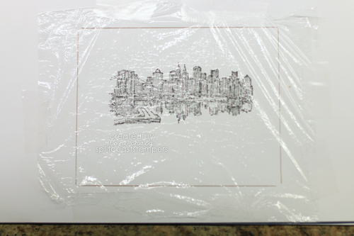
I followed the tutorial with a slight modification. I stamped my image on the guide scrap paper that Audrie mentions. Here I’ve outlined a cardfront size rectangle so I have a feel for placement of my final image.

I have tried similar concepts to this tutorial before, but the plastic wrap over a guide was a serious lightbulb moment for me! I covered the stamped image and marked off card front space with plastic, as directed.

waterlogue3

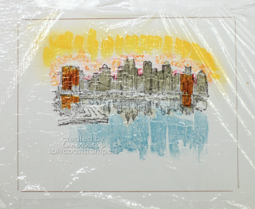
The I colored (dabbled Copic) over the top of the plastic wrap, using my stamped image as a guide for color and placement. Because your Copic ink is transparent on a glossy (non-porous) surface, you’ll want to use darker colors than you would if you were to sit down and color this image in traditional style.

Also, in the sky area, after I had colored in with deeper oranges and pinks, I did dust the skyline with YR31 from the Copic airbrush, just to fill in. I knew from my first run, that I might have some open, uncolored areas after the next two steps.

waterlogue4

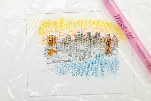
After coloring the plastic, spritz lightly with Copic Blending Solution.  After spritzing the colored plastic, place glossy side of your cardstock down  into the “wet mess”. Tap lightly and remove.

waterlogue6

This is my glossy cardstock, as lifted from the wet plastic piece. It dries so quickly.  I shy away from long-dry techniques. Probably why I like alcohol inks so much!

waterlogue7

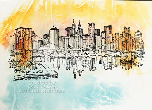
Finally, I stamp my image over the top of the glossy cardstock and finished my card.

waterlogue8

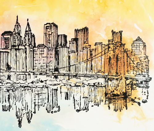
Before I leave you for the day, I wanted to comment to the detail of this stamp… I was so pleased, and I may be trying a few more of these scenic Americana location stamps soon. Look at the crisp imagery in each of those buildings!

waterlogue_brooklyn_bridge

LOVE this stamp of one of my favorite places… I {heart} NYC. Let’s see who is reading… with this angle and the city scape.. is this a photo of sunrise or sunset?

Thanks, Audrie for a great tutorial and thanks Crafter’s Companion for such a beautiful stamp!

One last thing… I just updated my Copic class listing to include the final Copic classes of the year, both certification classes and hands-on workshops. Please take a peek if you have any interest in ANY of the locations mentioned. We’d love to have you!

Back soon…


Don’t be so diSTRESSED…

deer-500x500

We just put the finishing touches on a fun project at Splitcoast! Our Product Focus review team had an opportunity to work with a new Clearsnap ink product. I had time to create a few fun projects for the gallery, and I thought I’d share them here.

I made the card above a few weeks ago for my Cutting With Detailed Dies tutorial, but also used the new Clearsnap ink in Dark Cashmere. I do love a nice, rich chocolate brown ink. These stamp cleanly and dry quickly. I love the circle deer die element (Beauty Lies Within – Taylored Expressions). So perfect for the many deer hunter’s in my life, and the heart (Hearts-a-Plenty Die-namics – MFT) and label (Label Stacklets 2 – Taylored Expressions)dress it up just enough that this works well for either a male or a couple. The Woodgrain Background is from MFT, and the Proverbs 16:9 verse is from Verve’s Scripture Medley 3.

typewriter-500x500

This is probably how I use distress inks most often… to give different papers on a single project the same tone by distressing the edges… here I used Dark Cashmere. The typewriter is stamped with Antique Moss, both from Clearsnap. This typewriter stamp and die combo is a fave… sadly, discontinued, but from the set Just My Type from MFT Stamps. The little kraft doily is cut with Mini Detailed Doily Dienamics from MFT.

distressed-wildflowers


And, lastly for today, a clean and simple nod to yesterday’s Color Challenge at Splitcoast. I used MFT’s Peaceful Wildflower stamps and coordinating die-namic set  for a clean and simple. The Clearsnap colors that I used here are Venetian Lace, Triumphant Red and Dark Cashmere. 

Still many, many fun things going on… hope you are creating time to stay crafty!

Cutting with Detailed Dies

DetailedDies Newsletter Image 375x375

Someone left the backdoor at Splitcoaststampers unlocked, and I dropped a tutorial off over there with some tips and tricks for using intricate, detailed dies. I have always loved those fancy die shapes, but they certainly require a little finesse to get crisp, beautiful cuts. After a lot of research and practice, I think I’ve got it figured out. You can see the full tutorial here.

This card was made with my favorite wheat stamp, Wheat Sheaf from Serendipity Stamps. I colored the image with Copic Marker and then airbrushed the background with the Copic Air Compressor and beautiful Copic YR31. The dies I chose to showcase this image are Floral Ovals and Fancy Square dies from Spellbinders

Thanks so much for stopping by!

Celebra’tion Time

Celebrations-Photo3

Kissing summer goodbye over hear and gearing up for a very busy fall! Lots of great things are happening!

We published a Product Focus review at Splitcoaststampers for Spellbinders a few days ago. I loved how quick and easy it was to create a completely coordinated project with fun dies, stamps, papers and embellishments…all from the same product line!

I call this ‘Sweetened Sunflowers’. I used a very easy tutorial from Splitcoast for Cammie’s Triangle Treat Box. Literally done in 3 or 4 minutes. I think my favorite element is the matted chevron tag with the scalloped layer behind… the tags come with a mini impression plate. So fun!

SpellbindersCelebrations-Photo5

Fun pierced circle dies make clean and simple, super simple and eye-catching.

black-and-gold-because

One of the stamps and die combo sets (yes…stamp and die combo sets!) I used is called Just Because. I love cutting multiple layers of a flower die out of wax paper and layering for a lightweight 3D flower embellishment. The embossed circle layer was created with a coordinating embossing folder.

Celebrations_Photo3

Tags and word dies make quick work of a sweet-treat ‘thank you’ gift, too!

Check out our team’s full product review to see how all the elements of the new Spellbinders Celebra’tion line easily work together and gather a few fun tips and ideas.

I’ll be back tomorrow with more fun stuff! Have a beautiful Monday Tuesday…YAY for the short week!

Oh DEER!

DTGD-OhDeer


Loved Teresa Kline’s Splitcoaststampers Dare to Get Dirty challenge today…

This stamp is a favorite. It comes from a Christmas set (Remembering Christmas – SU!) but if you have a deer hunter in your life, you know it is a year around activity. We are always checking trail cameras, moving deer stands, checking on crops in the deer stand vicinity, making jerky, washing camo clothing… all. year. long!  

Still plenty of time for you to join us in Dare to Get Dirty … and so many challenges to get your creative spirit moving. This is seriously my most productive card making week of the year, and it always seems so easy. 🙂

You can find all of the dirty little details here.

I’m headed to St. Louis for two Copic Certification classes. Excited to see some new and familiar faces and color, color, color! Thanks for looking!


Autumn Blessings…

DTGD-poppy_200K

It’s my turn to host a fun Dare to Get Dirty challenge for our Fan Club at Splitcoaststampers! I’m so excited!

It couldn’t be one of my favorite things without Copic markers – used here over patterned paper with a beautiful floral image from Bloom with Hope stamp set – both sets Stampin’ Up! Then I pulled out my beloved (seriously one of my all-time favorites!) Etruscan (long since retired – sad. sad. sad.) and went to town with Soft Suede Stampin’ Up! ink. Love the krafty look to that color of ink.  Finally, I ruffled crepe paper by stitching loosely on my sewing machine and then pulling the top thread to pucker and pleat it around the image layer and added a few sequins. Had so much fun making this one! 

Thanks for stopping by my blog! Hope you find time to join us for a few (or all) Dare to Get Dirty Challenges this year! Find the dirty details here.