Category Archives: Copics

forever be my always…

Verve_May2016_Lori Craig_1377

Verve May2016 Spotlight


Day Two of the Verve Stamps release previews with the Verve Divas and guests (me!) …Everything previewed this week will be available to order in the Verve online store on Friday, May 20.

I’m just heading home today from a short get-away with my husband in Yosemite, we had a wonderful time.


Verve_May2016_Lori Craig_1377

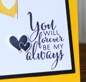
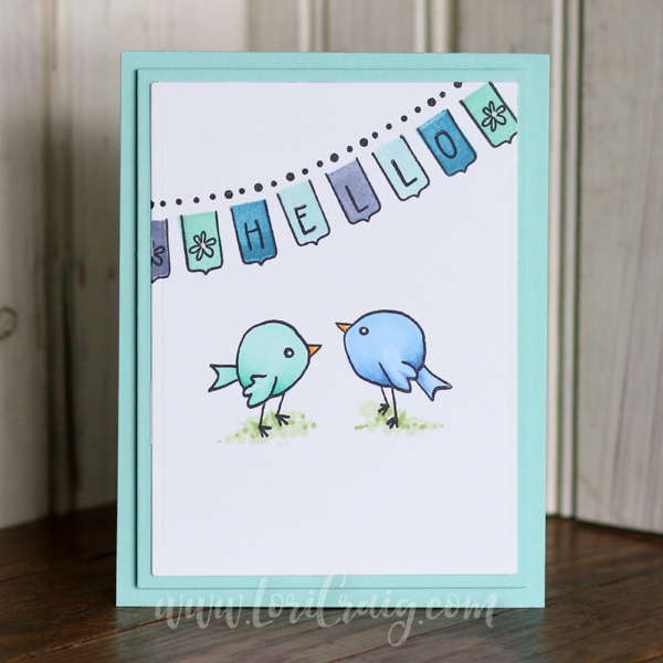
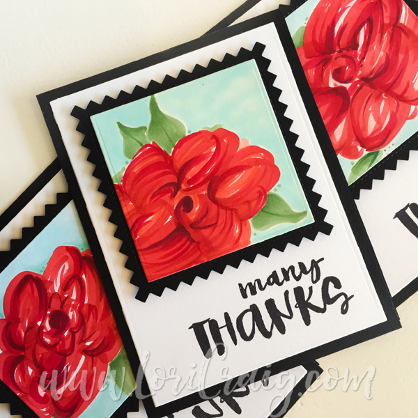
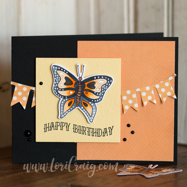
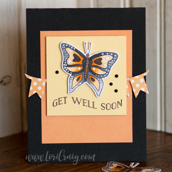
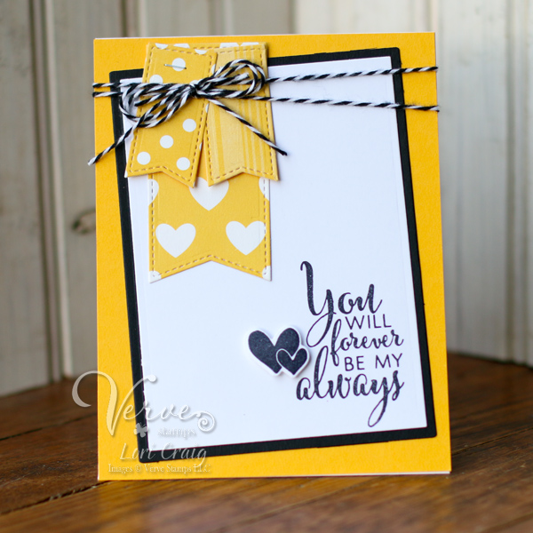
I’m sharing a sentiment and the sweet heart duo stamp from the new Love Everlasting set that will be available from Verve tomorrow. Here the bright yellow and black lets you make mushy stuff speak manly – you know, for the manly man who doesn’t want anyone to know how mushy he really is. 😉

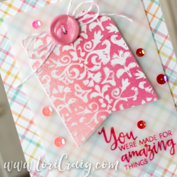
I cut several flags from the Stitched Pennants Die Set, also being released by Verve tomorrow! The smaller flags and the die cut Everlasting Hearts are popped up with XPress-It Double Sided Foam adhesive – the XPress It Foam has a tight hold and tears easily.

Verve_May2016_Lori Craig_1386

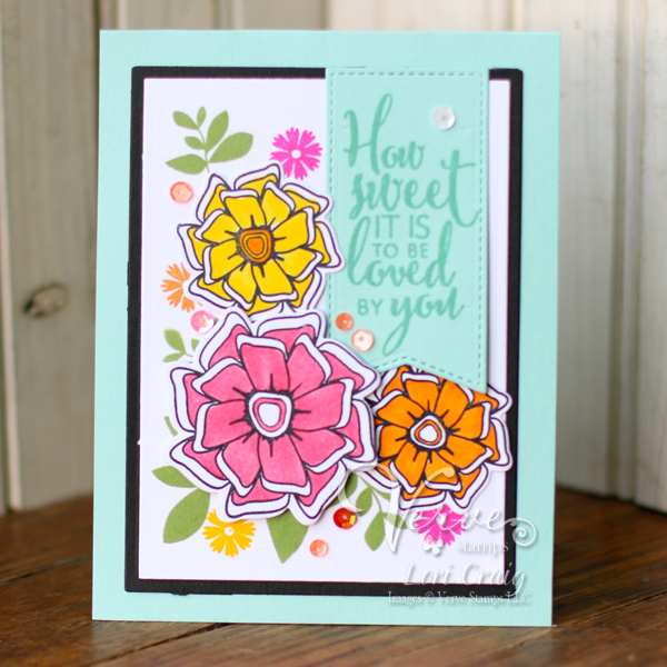
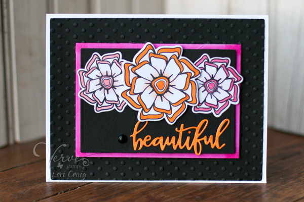
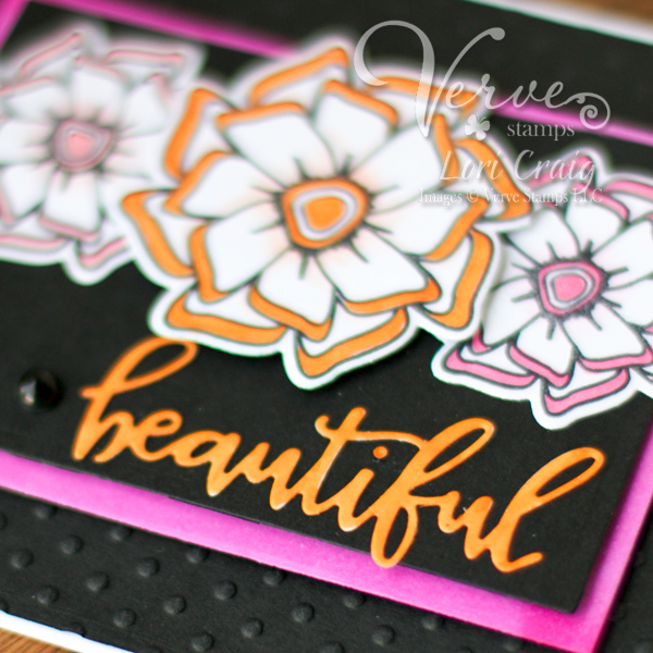
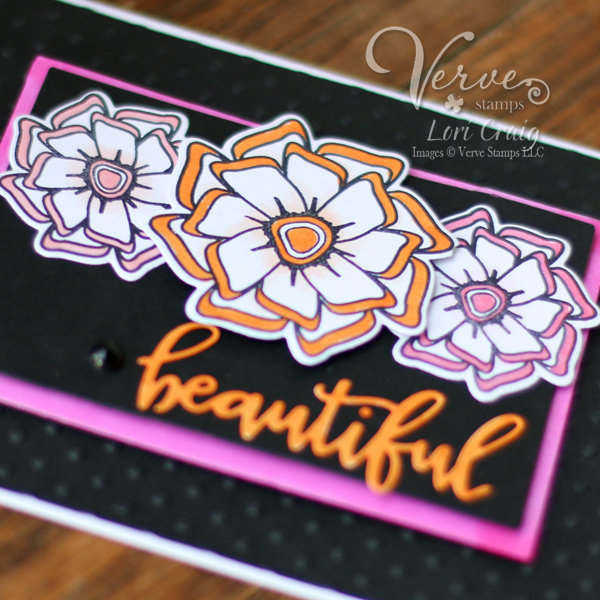
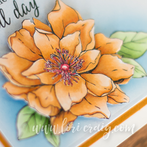
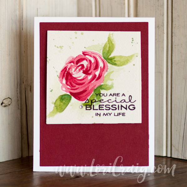
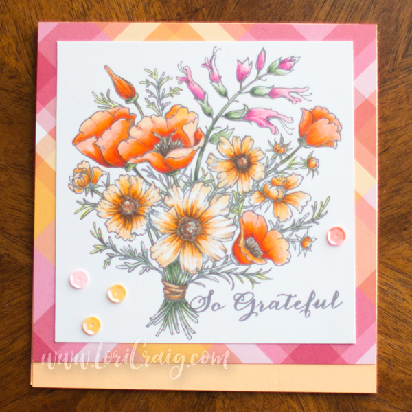
Next I wanted to share another card in a similar color scheme to the card I shared yesterday featuring theBeautiful Things flowers, Beautiful Flowers Die Set and Stitched Pennants Die Set along with another sentiment from the Love Everlasting set.

Verve_May2016_Lori Craig_1387

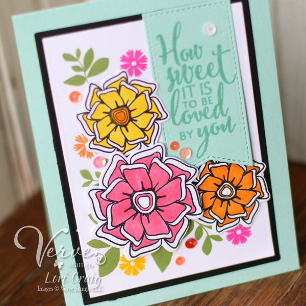
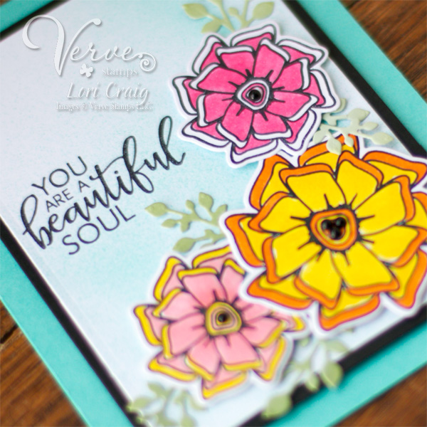
I have plenty of people in my life that are worthy of the sentiment, “how sweet it is to be loved by you”… I’m sure you have many, as well!  This card makes me happier than anything I’ve created in a long time. These flowers are just so easy to use!

Verve_May2016_Lori Craig_1389

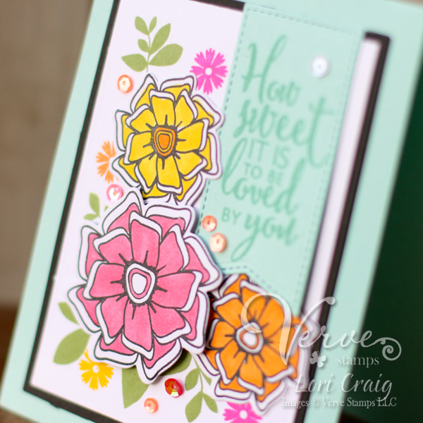
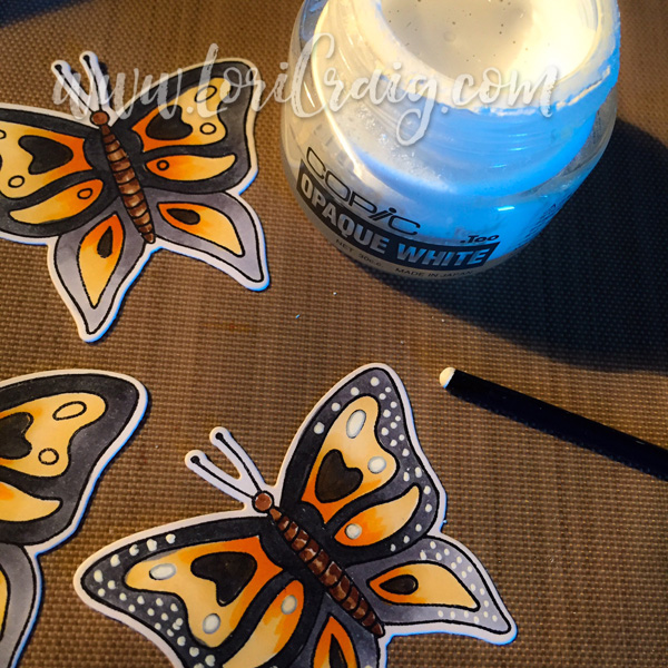
I’ve used the same color combo as yesterday, coloring my flowers with Copic Marker (Yo4, RV04 and YR04). I used XPress It Double Sided Foam Tape to pop my cut blooms for depth. Finally, I accenting the flower blooms with leaves and tiny blossoms from the Verve Bloom & Grow set and some fun sequins from the new Copper Blush Sequin Mix (also available tomorrow).

Verve Sneaky

Want to win some shiny new Verve? We’ll be picking a random commenter on one of the hop spots below to win today’s featured products! So be sure to leave a little comment on all the blogs below to increase your chances! Check out the Verve Blog today for the full hop list, a little more about our new products and all the prize info and deadlines!

Love Everlasting Everlasting Heart Die Set Copper Blush Sequin Mix

I hope you’ve enjoyed my cards today. I sure enjoyed making both of them! Tomorrow is release day for all of the new Verve products, and I’ll be back with another project for you…*IF* I can get all of my stinky Yosemite camping laundry going in the washing machine! 🙂

Have another beautiful day, my friends.

Amazing Things Splitcoaststampers Tutorial

stamped masking full image lori craig

In the hustle and bustle of all of the new Verve, Dina Kowal asked me if I’d be interested in creating a masking fluid and Copic Airbrush Stamped Masking tutorial for Splitcoaststampers… How can I say no to her?

stamped masking close lori craig

Check out my tutorial for Stamped Masking and Copic Airbrush at Splitcoast to learn how I made this quick and easy variegated tag – I even shot a video! What! What? Try this and let me know what you think!

I paired the Flourished Tag with pretty plaid from Lawn Fawn and a beautiful sentiment from the new Verve release set called Beautiful Things. This set is full of beautiful sentiments, and I know I’ll be using it over and over and over. The sequins are from Verve’s Copper Blush and Lots of Love Sequin Mixes.

I hope you enjoy my tutorial! Thanks for stopping by today…

Beautiful Soul

Verve_May2016_Lori Craig_1350

Verve May2016 Spotlight


I am so, so happy to be sharing a few new release projects for Verve Stamps over the next few days! When Julee emailed me and told me about these sets, I was drooling… sight unseen because of the phrasing… I didn’t even have to see them to know that they would be beautiful things with the magical words.


Today I’m sharing my first project featuring the Beautiful Things stamp set and Beautiful Flowers Die Set .

Verve_May2016_Lori Craig_1355

This was the first card I created for this release. You are a beautiful soul. The Beautiful Flowers were so easy to color, and the coordinating dies lined up nice and even…it was a real treat to color all of these blooms. I airbrushed a pale blue background and then popped the blooms up on X-Press It Foam Mounting Tape. Notice how my die cut leaves weave under and over the blooms? That’s an easy way to add depth and interest to any of your projects!

verve-blog-post-bookmarkI had been sitting in church last weekend, and flipping through Scripture that our pastor was sharing, and this bookmark uncovered itself. It’s a duct-tape bookmark that my daughter made. (If you have any pre-teen girls in your life, I know you’ve got your own stash of duct-tape accessories. My husband carries a camouflage duct tape wallet. #truth)

I loved the colors, and quickly made a mental note that I’d have to pair these up for at least one of my release projects. I feel like that inspiration definitely worked to my favor.

Verve_May2016_Lori Craig_1363

Next up, I wanted to share a simple ‘beautiful’ card that features the Beautiful word die cut and flowers colored and cut from Beautiful Things and Beautiful Flowers Die Set. I stretched out of my ordinary and grabbed some black cardstock to make things pop!

Verve_May2016_Lori Craig_1366

This beautiful word die does cut easily, and I didn’t have to poke or pick any of the little pieces out – even the dot for the i. Again, I’ve used X-Press It Foam Mounting Tape to vary the heights of my card elements for interest.

Here’s another trick I’ve been using a lot lately, I cut my die cut words or small accents from the same white cardstock (X-Press It Blending Card used here) that I color my images on and then color the die cut words with Copic Marker or the Copic Airbrush System. This way everything coordinates when I’m finished. The pink mat layer is cut from white X-Press It Blending Card and colored with Copic, as well.

I do recommend that you use the same white cardstock for each of your elements on a single card. Papers with different milling processes or raw material will have different weights, textures and tints that affect the finished visual color, so using the same white for each piece keeps the color matching consistent.

Verve_May2016_Lori Craig_1365

My Beautiful Things blooms are stamped in Black Memento and colored with Copic. The outer edges of the blooms are RV02, YR04 and R22 – The centers have a light feather blend outward of RV00, YR000 and R00, respectively.

Verve SneakyWant to win some shiny new Verve? We’ll be picking a random commenter on one of the hop spots below to win today’s featured products! So be sure to leave a little comment on all the blogs below to increase your chances! Check out the Verve Blog today for the full hop list, a little more about our new products and all the prize info and deadlines!

I hope you’ve enjoyed my Day 1 projects! I sure have enjoyed creating them and sharing them with you. Can’t wait to send the cards off to special someones! All of the Verve products I’ve shared with you today will be available for purchase on Friday… I will be back tomorrow with more goodies to tease you…

Have a beautiful day!


You’re Sweet

Concord 9th Youre Sweet Lori Craig

I’ve been stamping up a storm… and loving it!

I made some cards the other day to send to my sister-in-laws for Mother’s Day. Concord & 9th’s Wildflower was perfect! I kept my embellishments to a minimum because the post office has seemed to be so fussy lately with any embellishment additions… a little washi tape to anchor my stamped panel and these were off to the mailbox!

I’m off this week too…on a jet plane…  headed to Sacramento for Copic Certification and Flowers Classes, and then again the first weekend in June when I head to Des Moines to color with my friend Taylor – yes, that Taylor! You can join me for a fun set of Copic Certification and Flowers classes at the Taylored Expressions Studio! Still room in both of these classes before I take a break for summer fun!

I’ll be back tomorrow morning with more stamping! Thanks for stopping by!

Like Coloring… for Typography

lettering IMG_8257

I’m not much for idle time… and I’ve had a lot of car rider and airplane time lately. It’s been a gratifying time to sharpen my hand lettering skills, even what is often called faux~calligraphy.
lettering IMG_1242

I follow a number of different hand lettering artist on Instagram, and it’s been fun to practice different fonts that each of them scrawl out flawlessly.

At CHA back in January, I received a new pen from Copic,  the Gasenfude (pronounced: gas•en•fu•day), that has a nice nylon brush tip that is beautiful for hand lettering. The ink is both water and Copic-proof for drawing, lettering and coloring. The long nib takes a little practice to work with if you are new to brush pens, but even the amateur results are worth it! I have enjoyed keeping a senseBook journal of my hand~lettering practices. Yes, my Gs need some help!

Continue reading

Intro to Coloring Spring Flowers

lori craig mmh april2016 full

It’s been quite a month around here, as I’ve been  had several sets of Copic classes which has kept me hopping and kept me enjoying classes with a lot of fellow Copic lovers! And in my spare time, I’ve been coloring flowers from the new My Monthly Hero kit… always a way to wind down and relax…

CBINTRO2

When creating this card with the golden blossom, I used a color combination suggested in the Intro to Coloring with Copic Markers book from Imagination International (the North American distributor for Copic Marker). Michelle posted a GREAT video walk-through of the Intro to Coloring book, if you want to take a peek! You can find it HERE.

The book is a great resource to get you started with blending techniques and color selection. I took the colors for this card right from the suggestions on page 19, so that made for quick and easy work of the creative attack plan!

MMH-300x359

The flowers and images for this project came from the April Hero Arts kit, the My Monthly Hero Kit! And it sold out before my box even arrived, so I know that many of you loved it as much as I did! I can’t wait to see the new kit coming next week! These have been great creative sparks for me with coordinating elements (this month was Daniel Smith Watercolors – swoon!) and dies!

mmh color combo lori craig

To get started, I took the suggested color combination right off of page 19 in the Intro to Coloring book… gotta love easy!
mmh lori craig april2016 closeB

I colored my blossoms on a single 1/4 sheet of XPress It Blending Card and the leaves on a second 1/4 sheet of XPress It. For the leaves, I used the clear stamp of the large blossom as a placement guide before stamping so that the edges of the leaves would peek out from under the flower when the card was assembled.

I used the color combinations suggested on page 19 of the Intro to Coloring Book for a quick and dirty work of this one! The large flower was created with natural blending group YR20-YR27 and the leaves are a combo of YG11/YG13/YG17.

Continue reading

Single Layer Salutes

hello one layer lori craig full

On Monday, my famous neighbor Laurie came over to visit for the day… We have a fun time when we get together! I loved playing with the goodies she brought over to show me, like these adorable birds from Concord & 9th – such a fun, newer stamp company run by Greg and Angie ~ the sweetest people ever!

Laurie and I laughed so much that neither of us got much stamping done, but I managed to pull off two quick flat cards that I’m calling single layer salutes and sharing with you today! I know they have multiple layers – but they are monochromatic and have no doo-dads or trim that will trip up the envelope at the post office! 🙂

This first card above uses Concord & 9th’s sweet Birdie Banners – so easy to use. I colored my birdie bodies with Copic, but you don’t have to… it’s got a 2nd step fill in for the body color and the banner options are adorable. I surprised myself by how easy the banners were to line up – the banner fill-ins are a 2nd step stamp, too! The sentiment was stamped with Banner Alpha Bits.

lovely vase full front lori craig

This next card is a little harder to show-off, but it’s lovely. Please trust me on this.  The Bouquet Die is gorgeous! Now I’m wishing I would have cut one in a color to really showoff for the camera while Laurie was here, but you can see it here. I paired the bouquet with ‘lovely’ from Wonderful Words.

lovely close lori craig

I used a sheet of sticker paper to cut my two elements, and then I pieced them together for a seamless look. Very simple, clean and flat for mailing. I love it in white, but would be beautiful in almost any color variation for a mono-chromatic look! Will be adding these dies to my collection and making several more of this design!

I’m a little off of my normal routine today, so mid-afternoon and I’m headed out for a quick jog. It’s a gorgeous (albeit windy!) afternoon here in Kansas, so I’m looking forward to it. Since I’m normally stumbling out of bed at 4:40 and running at 5am, I better make sure all of my clothes are on right-side-out! LOL

Thanks for stopping by today! Be back soon!

Multiplying Creativity and Wide Copic Roses

Copic Wide Roses Lori Craig

I’m sharing a very fun set of cards today, that were way out of my comfort zone! As in, I couldn’t believe I would attempt something like this (or dare to share!) because the roses weren’t stamped, they were drawn by me… freehand…and not with a pencil first but with Copic Marker!

I always told myself that I couldn’t draw or paint because everything didn’t come out of the pen looking like someone else’s masterpiece the very first time. I would say that I didn’t get the artist gene, but I never did much to explore or give it a chance either.  More and more over the last few years of diligent observation and study, I’ve started practicing and drawing and painting for my own pleasure, not for anyone else’s expectation or critique. Surprise: I like it, and the more I practice, the more I enjoy it.

This past winter I took an incredible watercolor class from Online Card Classes. The class was called Watercolor – Intermediate Techniques, but I hadn’t taken any classes previous, and I was able to keep up! I learned so, so much about so many different aspects of art and watercolor. There were many concepts that I have adapted to other mediums, especially Copic and how I use them. Today’s set of cards are one of those things.

1 expressive watercolor roses lori craig

The card above was one that I created for my class homework using watercolor and one brush with a combination of wet-on-wet and wet-on-dry watercolor technique. I used Windsor Cottman watercolor paints and Arches 110# Cold Press paper.

I am well aware that I need more leaf practice, but I was very, very happy with how my free-brushed roses were turning out with a little effort. So on Saturday night, as I watched the NCAA basketball tournament (sad for my Kansas Jayhawks, #goBig12), I was thinking that it would be fun to try the same idea with my Copic Markers.

Continue reading

Butterflies, Seattle and Calgary, eh!

HB HeroArts Lori Craig

After our Easter Sunday celebrations and dinner, I had some time to get crafty yesterday! I need a few cards, and I’m also prepping some samples and ideas to take to my next Copic Standard and Intermediate Certification classes and our awesome new Coloring Flowers Color Along in the next four weeks in Seattle (April 8 & 9) and Calgary, Alberta (April 22 & 23)! I’d love to have some of you join me! All of the details can be found HERE.

I had also wanted to color the butterflies from the Hero Arts My Monthly Hero – I loved the bugs that Marianne drew for this kit! All of the contents of this kit work together for cards as clean and simple or as detailed as you dare! Very fun!


butterflies lori craig

I colored my butterflies wings with Copic Sketch Y32 and YR04 – flicking the colors together from opposite ends of the inner wing. Because I was coloring to mimic the Monarch species, it was easy to color in the black and white spots on the wings after smoothing out the color. The colors I used for black were C4/C6/C8.

After my wings were colored, I cut them with the coordinating die, and I do want to mention how easy these were to line up. I was worried that I’d never be able to cut the antenna straight (I am impaired sometimes when it comes to die line up!), and it lined up perfectly for me every time within the die! I didn’t throw a single butterfly away!

After cutting, I used the blunt point of a paint brush to dot the speckles of the wings with Opaque White. Such a bright vibrant, opaque white! The larger circles were filled in with a brush tip of the paintbrush.

Tip: When painting with Opaque White,  you’ll achieve smoother results if you paint multiple thin layers that dry in between, as opposed to trying to dab all of your color on in one application.

get well hero arts lori craig

I finished my cards off with some coordinating cardstock and a snippet scrap of polka dot paper – I liked how the white dots were a re-occurring theme. The sentiments come from the coordinating Hero Art’s set Ribbon Messages Stamp & Cut!

I was full of trying new things this weekend, and I do have another fun project to share tomorrow…maybe my favorite thing that I’ve made in a long time! Have a great night, and see you again soon!

Thanks for stopping by!


Printing Images for Copic Compatibility


power poppy full image lori craig

I’m often asked in Copic classes about printers for digital stamps (like this beautiful Countryside Bouquet from Power Poppy!)  that are compatible with alcohol inks. I’ve had more than my share of printers through the last 7-10 years, and more often than not, I’ve ditched them for cardstock issues, not ink compatibility. It is so hard to find a printer that will feed cardstock and thicker mediums without dog-earring the corners or jamming. For me, I’m happy to say those days are over!

power poppy close lori craig

For the last few months, I have been working with one of my co-workers at Splitcoaststampers on a collaborative project with Epson SureColor Printers, and I have enjoyed using with the SureColor P600. We published an overview of this printer at Splitcoast this morning, and you can find the full skinny here.


power poppy full image lori craig

To test digital ink for Copic compatibility, I follow a tried and true method that I learned from Marianne. I print a sample image on XPress It Blending Card and color right up TO the printed ink, but not over it with my marker nib. (When I’m not sure about compatibility, I don’t want to run my marker nib over an unknown substance!) I saturate the paper with Copic ink – a small, small spot will do. As the ink spreads over the printed ink, you’ll be able to watch the printed image either hold tight or it will start to run and meld. If it holds tight, you have a match!

power poppy on wood bg lori craig

My Countryside Bouquet was printed on XPress It Blending Card and colored with Copic Markers.

  • oranges – YR02, YR04, YR07, R24
  • yellows – Y32, Y35, Y38
  • pinks – RV21, RV23, RV25
  • greens – G21, G24, G28, G40, G43, BG93

My image was mounted on some pretty Lawn Fawn plaid patterned paper and accented with sequins. The sentiment is from the Fanciful Feathers set from Wplus9 Designs.

Thanks for stopping by today! I’ve got two other decor pieces to share with you from my printer project, so stop by tomorrow! Have a fabulous, colorful day!