Category Archives: watercolor

Beautiful Day

Beautiful-Day-Full-Lori-Craig-600x600

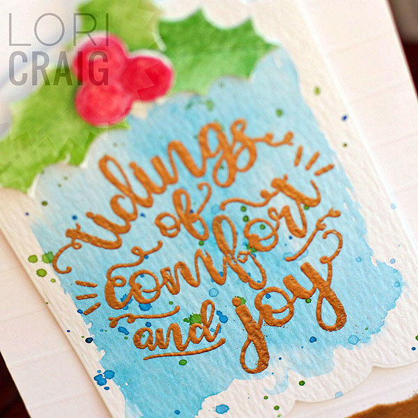
Some time in the craft room over the weekend… it had been so nice and warm here all last week, and then the weekend brought a cold wind. I’ve been itching to work on a project out in our barn, but I’m a fair-weather girl out there… I’m also in-between teaching trips right now, so hanging out in the office was a perfect time passer!

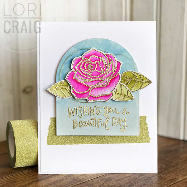
I’ve chosen a clean and simple look for this card so that the bold blossom shines, so today I’m sharing some things that help your clean and simple designs rock! Believe it or not, this design style can be more difficult to pull together than a card with lots of details. When card design has clean lines, it is hard to hide imperfect details, but there are things you can do to help yourself!

beautiful-day-close-up-600x600

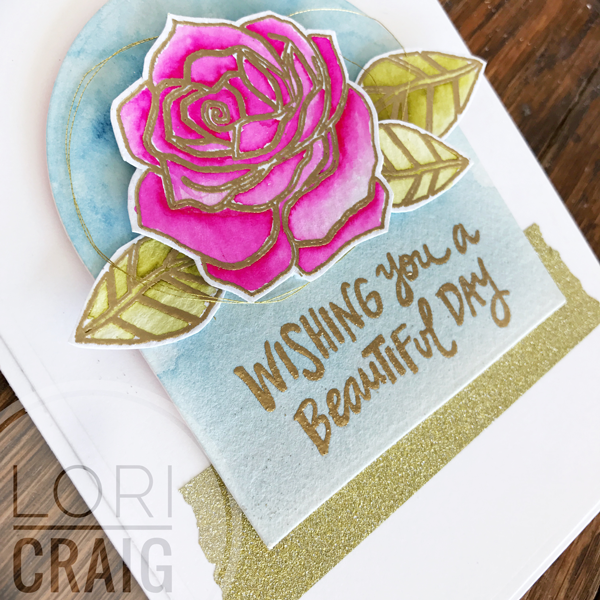
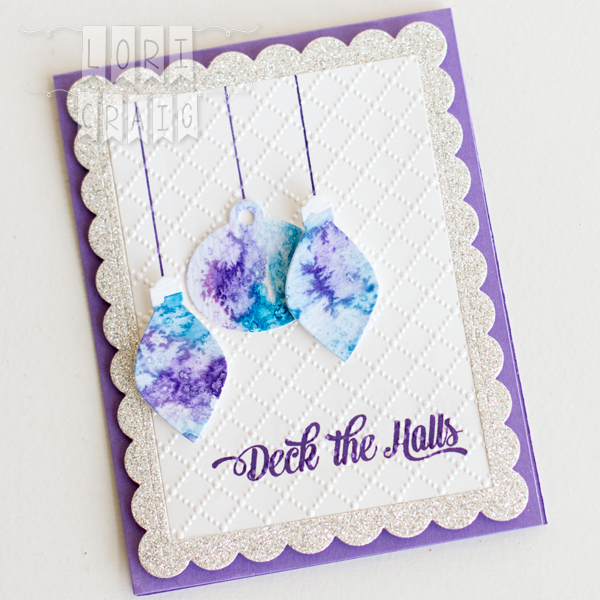
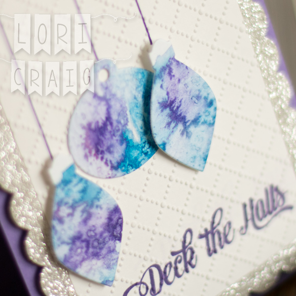
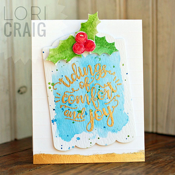
This is a card that I watercolored with Rose Garden from Reverse Confetti. I love Jen’s bold, graphic designs – and watercolor softened this one up so easy peasy.

The images were stamped with Ranger Embossing Ink and sprinkled with Princess Gold Embossing Powder – love, love this shade of gold – not to brassy and just the right shine. I don’t have the Rose Garden Cuts to this set, but the not-at-all-fussy cutting was super easy.

Today, I’ve used Tim Holtz Watercolor Paper…. Heavier watercolor paper can be a bit more challenging to create layered cards with because it warps a little with the water – you can always re-mist after you have painted and flatten with pressure (a heavy book sandwich anyone?), but I don’t suggest ironing paper with embossing powder to flatten. The heat will melt away your embossed detail.

hightack foam

high tack double sided


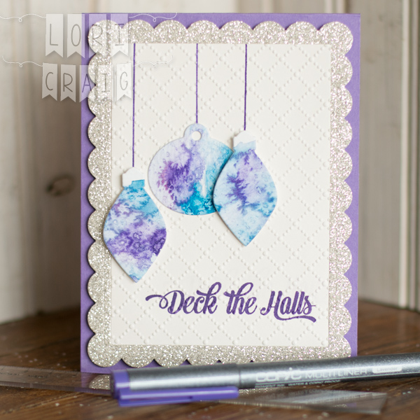
What makes this type of project with heavier paper easy to assemble is a good adhesive. Here, I’ve used a combo of XPress-It high tack adhesives –  High-Tack Double Sided Adhesive and High-Tack Double Sided Foam Adhesive. The firm hold is great for both flat or lifted layers and the low price-point is perfect. One thing I appreciate most about the double-sided tape is that the layers of my large white panel stay completely adhered to the white card base, no lifted or curled corners.

beautiful-day-lori-craig-tsquare-600x600

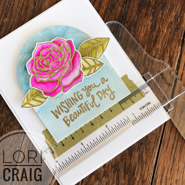
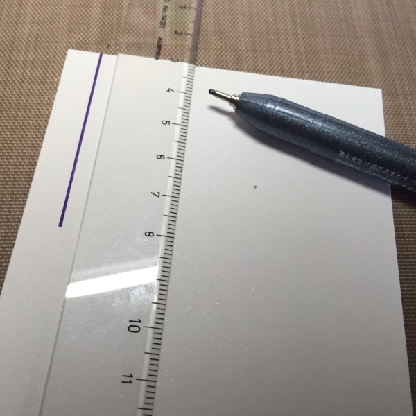
Finally, straight layers or wonky – there is no middle ground here, straight means super straight. First, I’ve laid a simple layer of thick Gold Glitter Deco Tape from Imagination International at 1/3 from the bottom of the card.  Then, I wanted to share a little tip for squaring up the free-floating layers with you. I use a simple, clear plastic t-square. I got mine at Hobby Lobby, but found this one at Amazon to show you an example. Makes it so quick and easy to line things up evenly which is very important with a CAS design. At the last minute, I added a bit of soft, super light-weight gold thread behind my rose bloom.

Beautiful-Day-Full-Lori-Craig-600x600

That’s it. Done, and I’ll be dropping this in the mail. I’ve been sending more cards lately. I hope it brings a smile to the recipients, and it sure does feel good to share the love.

Wishing you a beautiful day, friends!


Deck the Halls in Lavender

full deck the halls white lori craig

Today I am sharing one of my last few cards for the SCS Falliday Fest! This was for Lydia’s challenge to create Melted Snow – watercolor and salt background! Also showing you a fun new product from Copic, the Lavender Multiliner. How fun!

We have had a Salted Backgroung tutorial in the Splitcoaststampers library for years, and trying the technique was an assignment for me in a recent watercolor class that I participated in, as well. Way past time that I tried it! It was easy, and I love how it turned out!

deck the halls lori craig

I used Winsor Newton Cotman Watercolors – Purple Lake and Manganese Blue. I painted both on watercolor cardstock, leaving a bit of excess water on the surface and then sprinkled liberally with coarse sea salt. Allow the cardstock to dry and the salt will absorb and shift the color around on your paper. You can use a heat tool to speed this process up, but I’m a fan of allowing for natural dry time when I can!

I had been so wrapped up in the technique, I decided to follow Lydia’s inspiration and go the Christmas ornament route. I cut my bulbs from a retired die set from Taylored Expressions.

deck the halls lori craig full

I “hung” my ornaments with string I drew in with a new Lavender Copic Multiliner. They arrived a few weeks ago, and I love the rich purple color.  As you would expect with a Multiliner, the ink from these pens will hold tight with Copic and water when they are dry on the paper.

IMG_1803Here, I’ve just dropped a few lines of string in to hold my ornaments. You could totally free-hand the lines of the ornaments, but here, I wanted crisp, straight lines for the string, so I’ve used a small clear ruler from Aristo. I keep two of these in my stash. Love that I can tuck them into a pencil pouch and that they are clear to see my work underneath. lavender set


The Lavender Multiliners for drawing, sketching and coloring over are available in four tip sizes: 0.03, 0.05, 0.1, 0.3, & 0.5mm. Pen sizes are embossed on the caps for durability. Available as single pen purchases and in this set of four.

  • deck the halls sentiment

I wanted texture to my white layer, and I also did not want to add a sentiment tag. So, the Deck the Halls sentiment (retired MFT) was stamped in Grape Jelly ink (Taylored Expressions) and then my panel as run through the Big Shot between the Dotted Lattice folder. I love how it embossed right over the top of the sentiment without distorting the words.

I added the bulbs with XPress It Foam Tape to my white panel.The glittery frame (glitter paper from Stampin’ Up! – a gift from Lydia!) is from the Taylored Expressions die set – Frame in Frame 2.

deck the halls full no ml lori craig

I appreciate you stopping by… I know it’s Halloween, but it will be time to Deck the Halls before you know it! Have a great day!

Comfort & Joy

FullSizeRender (21)Falliday Fest Lori Craig

Another Falliday Fest card to share with you… this idea came from Holly Brown and the challenge was to add holly and berries to your card. I am loving the Christmas projects that this set of challenges encouraged me to think about and execute! I didn’t get any mass production done for Christmas, but I have a LOT of fun ideas that I can pull together quickly now! Love that!

I loosely watercolored the blue and green background and cut with a tag die. Next, I cut the holly and berries from watercolor paper and painted loosely. This is a fun way to watercolor and not have to mess with sticky details!

The  holly die and the cute tag die are from Reverse Confetti, and this was so easy to make that I’m thinking of going into mass production for a handmade Craig Christmas card for the first time in too many years! The holly leaves are scored for easy creasing and dimension and the berries have two layers so you can easily add the highlight and a little depth! Details! Details!

FullSizeRender (20)Falliday Fest Lori Craig

The sentiment is from an Avery Elle set called Comfort and Joy! It embossed beautifully with a new embossing powder – Princess Gold from Ranger.  (You can also find it at Michaels!) When you emboss over watercolor, make sure that the watercolor is 120% dry (totally dry!) or you will have an embossing powder mess on your hands! (Ask me how I know!) I’d be extra careful and use an embossing static removal tool – I have lost mine, so while I was at this retreat, I (accidentally permanently, it seems because it came home with me) borrowed one from Jill Hawkins. (Sorry, Jill! I will think of you fondly every time I use it until we meet again!) 

Thanks for stopping by today… I’m fortunate to be pulling together some month end projects and crafting away. Happy Friday!

My Watercolor Wheel and Tools of the Trade

Color Theory Lori Craig

As we’ve been winding down the summer and getting both of my girls settled into high school for the year, I’ve been hitting the books myself! I’m currently watching a FABULOUS watercolor class being taught by my friend, Michelle Wooderson called Close to Home A Watercolor Landscape Journey.

kinsale watercolor

In anticipation of this class, I did take a little Winsor Newton travel palette on vacation earlier this month.  I thoroughly enjoyed sitting on the dock at my father-in-law’s home on the Chesapeake Bay and painting the day away… There is something so peaceful about being outside. I was happy with the trees… I’ve much to learn regarding water and sky…

Thus far, I feel like I am learning what I thought I wanted to know.  I highly recommend Michelle’s comfortable teaching style and the way she lays out her information.

cattle pen sketch lori craig

As I’m delving into the painting process, first, I wanted to show you the start of another painting…  On the left is a small sketch that I used to layout value on my final image and color selection before I start painting – I used an Aristo .5mm Mechanical Pencil and Aristo Click Eraser from Imagination International. Great tools for your desk or a small travel bag!

I’d love to get outside this weekend with my sketchbook, but I started this freehand from a photo that I took of the beautiful Kansas Flint Hills, not far from my home. Eventually I’ll paint the larger sketch above on the right.

value scale sketch lori craig

The mechanical pencil was great for adding value in my small sketch – light shading to heavy hatch marks allow me to color map.

You can see a quick Copic Warm Gray value scale on the left… And, it’s helpful in making a color map. This is something I often do with more detailed images when I am coloring with Copic. Once the map is created, you don’t have to think about the “where” and “why”  – if you are interrupted mid-project, you just check your map and go… like driving a car! The Copic class Vintage Value and Monotone workshop or the Intermediate Certification are other great resources to learn more specifically about shading and color value.

ROYGBIV swatches Lori Craig

One of my first colorful tasks was to finish swatching paint samples. I wanted to see if I had color gaps that I {ahem} should fill. It took a few minutes, but I’m thrilled to have swatches of true color that I can use when I’m working to color match … the actual pigment almost NEVER matches the packaging… We all know that!

I’ve started out with Winsor Newton watercolors… They were readily available to me, and a reasonable price point for a newbie. I had some that I purchased for the Watercolor for Card Makers class I took last winter… I did need to add a few tubes. I love the rich colors, and I won’t lie… the fancy silver tubes make me feel like a longtime artist! I’m a sucker for pretty packaging!

color wheel close up


After I selected a rounded color palette with my swatches, we really talked about the color wheel. I painted a large watercolor wheel that I can hang in my studio for reference while I work. This sheet is 10″ x 14″… I love seeing the colors run next to each other… I can’t wait to start painting!


So, what do you want to learn this fall? I’m so grateful that we can always keep learning, growing and stretching. Art is so good for the soul in that regard… Let’s hit the books!

More tomorrow… including a winner for my Concord & 9th giveaway!