
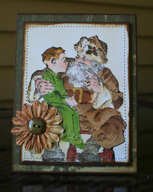
The first time that I color a detailed image, like this Santa’s Lap from the Saturday Evening Post collection at Cornish Heritage Farms, I try to color it similar to the label. I find that very helpful in getting my bearings with the image…the shading, the shadows, etc. Then I like to try to branch out and try my own color schemes. I still use that original label as a reference, but it’s somewhat easier the 2nd and 3rd time around. So, if you struggle with an image that you see beautifully colored in your mind but not the same affect on paper, keep trying. When I recently completed my Copic Certification, I was shocked when Marianne (marker goddess) said it sometimes took her HOURS to color an involved scene. I don’t know why I thought I could do it in 30 minutes… eye rolling here.
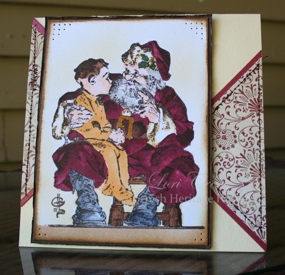
This was an image I colored at the lake this past weekend. I used the panel to work into this week’s Sketch Challenge at Splitcoast.
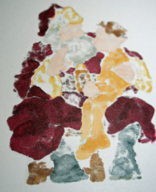
The key with Copics is patience and giving the ink enough time to give you solid coverage. This is how this colored image looks from the back. See how the ink soaks through and gives you almost a complete picture on the back of the cardstock? This soaking is what gives you the ability to meld you colors together and move the color for shading.
See you tomorrow with some fluttering inspiration….


7 responses to “Vintage Santas”